10 Kitchen Cabinet Color Trends You'll See Everywhere in 2025
- oliverjames0609
- 2 days ago
- 18 min read
The heart of your home deserves a fresh, modern look, and nothing transforms a kitchen faster than a new cabinet color. Moving beyond the all-white kitchens that dominated the last decade, today's design landscape is rich with sophisticated hues that add personality, depth, and timeless appeal. But with so many options, navigating the current kitchen cabinet color trends can feel overwhelming. This definitive guide is designed to simplify that process, providing a curated roundup of the most impactful and enduring colors for your space.
We'll dive deep into each trend, from moody blues and earthy greens to warm, inviting neutrals. This isn't just a list of popular colors; it's a comprehensive resource packed with actionable advice. For each trend, you'll discover:
Practical Palette Pairings: Specific recommendations for countertops, backsplashes, hardware, and flooring that create a cohesive and stylish look.
Finish and Lighting Advice: How to choose between matte, satin, or gloss finishes and how different lighting conditions affect each color.
Resale Value Insights: A straightforward analysis of how each color choice might impact your home's marketability.
Real-World Visualization: We provide specific paint color matches from brands like Benjamin Moore and Sherwin-Williams to help you get started.
Understanding these trends is key, but it's also helpful to see how they are being applied in specific regions. For instance, you can explore articles focusing on local kitchen cabinet color trends to see what's currently popular in different metropolitan areas. Whether you're planning a full renovation or a simple weekend refresh, this guide provides the inspiration and practical details needed to select a cabinet color that elevates your kitchen and perfectly reflects your personal style.
1. Deep Navy and Charcoal
Moving beyond traditional black, deep navy and charcoal have emerged as sophisticated, moody alternatives that bring drama and depth to the kitchen. These rich, saturated hues act as a bold neutral, providing a strong foundation that pairs beautifully with a wide range of materials and finishes. As a key component of current kitchen cabinet color trends, these dark tones create an atmosphere of modern elegance and timeless appeal, making them a favorite for both contemporary and transitional designs.
This trend excels in kitchens with ample natural light, where the color can be fully appreciated without overwhelming the space. It’s also an effective strategy for creating a focal point, especially when used on a kitchen island or a single wall of cabinetry. The result is a high-contrast, luxurious look often seen in high-end projects by designers like Amber Interiors and in the aspirational kitchens featured by brands such as Restoration Hardware.
Palette Pairings and Finishes
To successfully implement deep navy or charcoal, balance is essential. Here’s how to build a cohesive palette:
Countertops & Backsplash: Pair dark cabinets with light-colored countertops like Calacatta marble, white quartz, or even a light butcher block to create a striking contrast. A simple white subway tile or a dramatic marble slab backsplash will complete the look.
Hardware: Metallic hardware is crucial for adding warmth and visual interest. Brushed brass, polished nickel, or champagne bronze pulls and knobs pop against the dark background, adding a layer of sophistication.
Finishes: A matte or satin finish is highly recommended. These low-sheen options absorb light rather than reflecting it, which enhances the color's depth and helps conceal fingerprints better than high-gloss alternatives.
Expert Tip: To prevent the space from feeling too dark, integrate ample lighting. Strategic under-cabinet LED strips, statement pendant lights over an island, and well-placed sconces will illuminate workspaces and highlight the rich color of the cabinets.
Color Swatch Matches
Benjamin Moore: Hale Navy (HC-154), Cheating Heart (1617)
Sherwin-Williams: Naval (SW 6244), Iron Ore (SW 7069)
Behr: Ink Black (N490-7), Graphic Charcoal (N500-6)
2. Warm White and Cream
A timeless choice that never goes out of style, warm white and cream offer a soft, inviting alternative to stark, cool whites. These hues incorporate subtle undertones of yellow, beige, or ivory, creating a kitchen atmosphere that feels bright, clean, and welcoming. This enduring cabinet color trend provides a versatile and classic foundation, perfect for styles ranging from traditional and modern farmhouse to minimalist Scandinavian designs.
This trend is championed by designers like Joanna Gaines and is a staple in the aesthetics of brands such as Pottery Barn and Restoration Hardware. Warm whites are incredibly effective at making smaller kitchens feel larger and more open, as they reflect light beautifully. Unlike their cooler counterparts, these creamy tones prevent a space from feeling clinical, instead wrapping the room in a subtle warmth that is both sophisticated and comfortable.
Palette Pairings and Finishes
Creating a layered, intentional look with warm whites is key to avoiding a flat appearance. Here’s how to build a dynamic palette:
Countertops & Backsplash: Add definition by pairing cream cabinets with darker countertops like soapstone or a rich walnut butcher block. For a softer look, consider a warm-toned granite or quartz with beige or gold veining. A textured backsplash, such as zellige tile, can add depth and character.
Hardware: Contrasting hardware makes a significant impact. Matte black pulls create a modern farmhouse feel, while brushed brass or champagne bronze adds a touch of elegance and warmth.
Finishes: A satin or eggshell finish is ideal for warm white cabinets. These finishes offer excellent durability and are much easier to clean than a flat matte, which is crucial for a high-traffic area like the kitchen.
Expert Tip: Introduce natural textures to enhance the warmth of cream cabinets. Elements like wood open shelving, woven light fixtures, linen window treatments, and terra-cotta accents will create a rich, layered, and inviting environment.
Color Swatch Matches
Benjamin Moore: White Dove (OC-17), Swiss Coffee (OC-45)
Sherwin-Williams: Alabaster (SW 7008), Dover White (SW 6385)
Behr: Swiss Coffee (12), Off White (PPU25-09)
3. Sage Green and Muted Green
Reflecting a collective desire for tranquility and a connection to nature, sage green and other muted green tones have become a cornerstone of modern kitchen design. These soft, earthy hues bring a sense of organic calm into the heart of the home. As a leading choice in kitchen cabinet color trends, these versatile greens act as a "new neutral," offering a gentle hint of color that remains sophisticated and timeless, bridging the gap between stark whites and bolder shades.
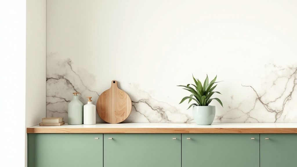
This trend is a key element of the biophilic design movement, which emphasizes incorporating natural elements into interior spaces. It shines in designs aiming for an airy, grounded feel, from modern farmhouse aesthetics to more minimalist Scandinavian styles. You can see this color elegantly executed in projects by designers like Emily Henderson and featured in the curated showrooms of Pottery Barn, where it creates a welcoming and serene atmosphere.
Palette Pairings and Finishes
To create a balanced and inviting space with green cabinets, consider these complementary elements:
Countertops & Backsplash: Pair muted greens with warm-toned materials like butcher block or light, creamy quartz. For a classic and clean contrast, a Calacatta marble countertop or a simple white subway tile backsplash works beautifully.
Hardware: Brushed brass or champagne bronze hardware adds a touch of warmth and elegance that enhances the green tones. For a more modern or industrial look, matte black pulls and knobs provide a striking, high-contrast accent.
Finishes: A satin or eggshell finish is ideal for sage green cabinets. This subtle sheen is easy to clean while still providing a soft, velvety look that diffuses light gently and enriches the color's natural character.
Expert Tip: Incorporate natural wood elements, such as open shelving, a range hood cover, or flooring, to amplify the earthy, biophilic feel. The warmth of the wood grain is the perfect complement to the cool, calming green.
Color Swatch Matches
Benjamin Moore: October Mist (1495), Saybrook Sage (HC-114)
Sherwin-Williams: Evergreen Fog (SW 9130), Clary Sage (SW 6178)
Behr: Laurel Tree (S390-5), Jojoba (N390-3)
4. Black and Matte Black
Once considered too daring for the average home, black has firmly established itself as a chic and sophisticated staple in modern kitchen design. This bold, dramatic color creates a powerful statement, grounding the space with an air of luxury and confidence. As a dominant force in kitchen cabinet color trends, black, especially in a matte finish, offers a sleek, contemporary aesthetic that minimizes glare and feels velvety to the touch.
This trend is a cornerstone of minimalist and industrial design philosophies, often seen in high-end projects by brands like Bulthaup and in the avant-garde work of designers like Kelly Wearstler. Black cabinets are particularly effective in open-concept spaces or kitchens with high ceilings and abundant natural light, where their dramatic impact can be fully realized without making the room feel enclosed.
Palette Pairings and Finishes
Creating a balanced and inviting kitchen with black cabinets requires thoughtful material selection. Here’s how to build a stunning palette:
Countertops & Backsplash: For maximum impact, pair black cabinets with bright white quartz or marble countertops to create a crisp, high-contrast look. Alternatively, a concrete or dark granite countertop can achieve a moody, monolithic effect.
Hardware: Warm metallics are key to preventing the design from feeling cold. Brushed brass, copper, or champagne bronze hardware provides a stunning contrast and adds a touch of glamour. For a minimalist approach, consider handleless cabinets or matte black hardware.
Finishes: A matte finish is the preferred choice for this trend. It diffuses light beautifully, hides fingerprints better than glossy counterparts, and enhances the color's depth, lending a sophisticated, modern edge to the cabinetry.
Expert Tip: Introduce natural textures to soften the boldness of black. Warm wood elements, such as an open shelf, a butcher block island top, or flooring, will add organic warmth and prevent the design from feeling too sterile.
Color Swatch Matches
Benjamin Moore: Black (2132-10), Onyx (2133-10)
Sherwin-Williams: Tricorn Black (SW 6258), Black Magic (SW 6991)
Behr: Black (PPU18-06), Limousine Leather (MQ5-5)
5. Dusty Blue and Slate Blue
Offering a softer, more subdued alternative to their bolder navy counterparts, dusty and slate blues have carved out a significant space in modern kitchen design. These muted tones possess a sophisticated, calming quality that feels both contemporary and enduringly classic. As a notable entry in the latest kitchen cabinet color trends, these versatile blues provide a serene backdrop that works exceptionally well in coastal, farmhouse, and transitional style kitchens, infusing them with a sense of understated elegance.
This trend is a favorite for creating kitchens that feel airy, livable, and thoughtfully designed. It's often showcased in coastal-inspired homes on design platforms like Houzz or in the farmhouse-modern projects featured by designers such as Lindye Galloway. The appeal lies in its ability to introduce color without overwhelming the senses, providing a tranquil yet stylish foundation that feels welcoming and refined.
Palette Pairings and Finishes
To enhance the inherent warmth and charm of dusty or slate blue, a carefully considered palette is key. Here’s how to create a harmonious look:
Countertops & Backsplash: Pair these blues with warm-toned materials to create balance. Butcher block countertops, creamy white quartz, or marble with gold veining are excellent choices. A simple Zellige tile or a clean, off-white subway tile backsplash prevents the design from feeling too busy.
Hardware: Warm metallics are the ideal complement. Brushed brass, champagne bronze, or even aged copper hardware provides a beautiful contrast against the cool blue, adding a touch of luxe warmth.
Finishes: A satin or eggshell finish is perfect for these colors. This slight sheen offers durability and is easy to clean while maintaining the soft, muted quality of the hue, preventing it from looking flat or overly glossy.
Expert Tip: Incorporate natural wood elements, such as open shelving or a wood-clad range hood, to warm up the space and enhance the color's organic feel. This adds texture and prevents the cool-toned cabinets from making the room feel sterile.
Color Swatch Matches
Benjamin Moore: Van Courtland Blue (HC-145), Providence Blue (1636)
Sherwin-Williams: Stardew (SW 9138), Granite Peak (SW 6250)
Behr: Blueprint (S470-5), Adirondack Blue (N480-5)
6. Two-Tone and Mixed Finishes
The two-tone kitchen cabinet trend moves away from monochromatic schemes, introducing a dynamic and personalized approach to kitchen design. This method involves using two different colors or finishes for the cabinetry, creating visual hierarchy and depth. As a standout among kitchen cabinet color trends, this approach allows for creative expression, whether by grounding the space with dark lower cabinets and light uppers, or by making a kitchen island a colorful focal point.
This trend is highly adaptable and can be tailored to any style, from modern farmhouse to sleek contemporary. A classic execution involves painting lower cabinets a deep, grounding color like navy or black while keeping the upper cabinets bright white or cream to make the room feel larger and more open. This technique, often seen in layouts by designers like Amber Interiors and featured in publications such as Domino, provides a custom, high-end feel without committing to a single bold color throughout the space.
Palette Pairings and Finishes
Successfully executing a two-tone kitchen relies on creating a harmonious yet interesting contrast. Here’s how to build a cohesive palette:
Countertops & Backsplash: Select a countertop material that unifies both cabinet colors. A white quartz with subtle gray veining, for example, can bridge white uppers and charcoal lowers. The backsplash can either match the upper cabinets to create a seamless look or introduce a third complementary texture or pattern.
Hardware: Choose a single hardware finish to tie the two cabinet colors together. Brushed brass, matte black, or polished chrome can act as a consistent accent across the different-colored doors and drawers.
Finishes: Combining different materials is a key part of this trend. Pair a painted finish on one set of cabinets with a natural wood grain on the other. For instance, white oak on the island contrasts beautifully with dark green perimeter cabinets, adding warmth and texture.
Expert Tip: To ensure balance, use the 60-30-10 rule. Let one cabinet color be the dominant (60%), the second the subordinate (30%), and use the remaining 10% for accents like hardware or decor. This creates a visually pleasing and intentional design.
Color Swatch Matches
Benjamin Moore: Chantilly Lace (OC-65) with Hale Navy (HC-154)
Sherwin-Williams: Alabaster (SW 7008) with Iron Ore (SW 7069)
Behr: Swiss Coffee (12) with Compass Blue (MQ5-54)
7. Warm Taupe and Greige
Moving away from the cooler grays that once dominated, warm taupe and greige have established themselves as the new go-to neutrals in kitchen design. This sophisticated blend of gray and beige creates an inviting, earthy backdrop that feels both modern and timeless. As a leading choice among current kitchen cabinet color trends, these versatile shades offer the contemporary appeal of gray while retaining the inherent warmth of beige, making them suitable for a wide array of styles.
This trend is championed by renowned designers like Studio McGee and is frequently featured in contemporary homes in Elle Decor and Domino. The color's adaptability makes it a perfect fit for transitional kitchens that blend classic and modern elements. It provides a soft, organic foundation that can be styled to feel cozy and rustic or sleek and minimalist, depending on the surrounding materials and finishes.
Palette Pairings and Finishes
To make the most of warm taupe or greige cabinets, focus on layering textures and complementary tones:
Countertops & Backsplash: Pair these cabinets with countertops in warm white quartz, creamy marble, or even a dark soapstone for a touch of drama. A handmade-look Zellige tile or a simple honed marble backsplash enhances the organic, sophisticated feel.
Hardware: Warm metallic hardware is a must. Brushed brass, aged bronze, or soft copper pulls and knobs add a necessary touch of warmth and prevent the neutral palette from feeling flat.
Finishes: A satin or low-sheen finish is ideal for greige and taupe. This finish offers a subtle glow that highlights the cabinet details without being overly reflective, maintaining a soft and elegant appearance.
Expert Tip: Introduce natural wood tones through open shelving, a butcher block island top, or flooring to enhance the warmth of the greige cabinets. This layering of natural materials creates a rich, lived-in atmosphere that feels both curated and comfortable.
Color Swatch Matches
Benjamin Moore: Revere Pewter (HC-172), Pale Oak (OC-20)
Sherwin-Williams: Agreeable Gray (SW 7029), Accessible Beige (SW 7036)
Behr: Perfect Taupe (PPU18-13), Toasty Gray (N320-2)
8. Forest Green and Deep Green
Evoking the tranquility and richness of nature, forest green and deep green have emerged as a sophisticated choice for kitchen cabinetry. These bold, saturated tones bring dramatic beauty and a sense of grounding to the heart of the home. As a standout in the world of kitchen cabinet color trends, deep green creates an atmosphere of organic luxury and stability, making a statement while maintaining a connection to the natural world.
This trend is a cornerstone of biophilic design, which seeks to connect building occupants more closely to nature. It is particularly effective when used to create a moody, enveloping feel or as a powerful accent on a kitchen island or lower cabinets. High-end design publications like Architectural Digest and designers such as Kelly Wearstler have showcased how these greens can transform a kitchen into a unique and opulent space.
Palette Pairings and Finishes
To harness the full potential of forest green, a well-considered palette is key. Here are some pairings that create a harmonious design:
Countertops & Backsplash: Natural materials are the perfect complement. White marble with subtle veining, warm butcher block, or creamy quartz countertops create a beautiful contrast. A Zellige tile or simple marble slab backsplash enhances the organic, luxurious feel.
Hardware: Warm metallics are essential for adding a touch of glamour. Brushed brass, antique gold, or champagne bronze pulls and knobs stand out beautifully against the deep green, providing warmth and a high-end finish.
Finishes: A satin or matte finish is ideal for deep greens. These non-reflective sheens enrich the color's depth and character, giving it a velvety appearance that feels both modern and timeless while minimizing the visibility of smudges.
Expert Tip: Lean into the natural theme by incorporating wood elements. Open shelving in a light oak, a wooden vent hood, or bar stools with wood accents will balance the deep green and enhance the kitchen's connection to nature.
Color Swatch Matches
Benjamin Moore: Salamander (2050-10), Forest Green (2047-10)
Sherwin-Williams: Ripe Olive (SW 6209), Jasper (SW 6216)
Behr: Royal Orchard (PPU11-01), North Woods (N410-7)
9. Soft Gray and Greige
Evolving from the stark whites of previous years, soft gray and greige have established themselves as the go-to neutrals for modern kitchens. These light-to-medium tones offer a perfect balance of warmth and sophistication, creating a serene and inviting atmosphere. As a cornerstone of contemporary kitchen cabinet color trends, greige (a blend of gray and beige) provides a complex, chameleon-like quality that adapts to different lighting and surrounding colors, ensuring it feels both current and timeless.
This trend is championed in minimalist and transitional designs seen in publications like Dwell and by high-end kitchen manufacturers such as Poggenpohl. Soft gray works exceptionally well in various settings, from compact urban apartments where it enhances the sense of space to large, open-plan kitchens where it provides a calm, cohesive backdrop. The versatility of these hues allows them to serve as a neutral foundation that can be styled in countless ways.
Palette Pairings and Finishes
To keep soft gray and greige from feeling flat, it's crucial to layer textures and complementary tones. Here’s how to build a dynamic palette:
Countertops & Backsplash: Pair with warm-toned countertops like a light butcher block, Calacatta Gold marble, or beige quartz to enhance the undertones of greige. For a cooler, more modern look, a crisp white quartz or a concrete-look countertop works beautifully with a true gray.
Hardware: Warm metallics like brushed brass, champagne bronze, or aged copper introduce a necessary warmth and contrast. Matte black hardware can also be used to create a sharper, more industrial feel.
Finishes: A satin or eggshell finish is ideal. These finishes offer a soft, subtle sheen that is easy to clean while avoiding the starkness of a matte finish or the high-reflectivity of gloss, which can wash out these delicate colors.
Expert Tip: Prevent a gray kitchen from feeling too cool or sterile by incorporating natural elements. Introduce warm wood accents through open shelving, flooring, or a butcher block island. Potted herbs and other greenery will also add life and a pop of organic color.
Color Swatch Matches
Benjamin Moore: Revere Pewter (HC-172), Edgecomb Gray (HC-173)
Sherwin-Williams: Agreeable Gray (SW 7029), Repose Gray (SW 7015)
Behr: Toasty Gray (N320-2), Perfect Taupe (PPU18-13)
10. Blush Pink and Soft Pink
Stepping away from conventional neutrals, blush and soft pinks have emerged as a daring yet sophisticated choice in modern kitchen design. No longer confined to purely feminine aesthetics, these delicate tones bring warmth, personality, and a touch of romance to the heart of the home. As a standout in current kitchen cabinet color trends, soft pink creates an atmosphere that is both inviting and uniquely chic, fitting perfectly within contemporary, eclectic, and even maximalist design schemes.
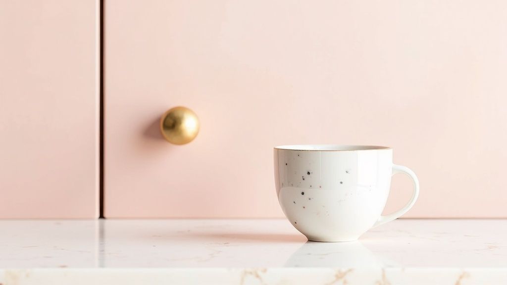
This trend is championed by avant-garde designers like Kelly Wearstler and is often seen in high-end residential projects and design-forward boutique cafes. The key to its success is using it as an unexpected, elevated neutral rather than a loud statement color. It works beautifully as an accent on a kitchen island or pantry doors, adding a personalized touch without overwhelming the space. This choice reflects a homeowner's confidence and desire for a space that is truly their own.
Palette Pairings and Finishes
To keep blush pink looking sophisticated and not overly sweet, the right pairings are crucial. Here’s how to build a balanced palette:
Countertops & Backsplash: Ground the soft pink with crisp, clean surfaces. White marble with subtle grey veining, creamy quartz, or even a light wood butcher block will provide a beautiful, neutral counterpart. A simple white zellige tile or a slab of honed marble for a backsplash enhances the luxurious feel.
Hardware: Warm metals are a perfect match. Brushed brass, copper, or rose gold hardware adds glamour and warmth, elevating the pink cabinetry to a new level of elegance.
Finishes: A satin or matte finish is essential for this trend. These low-sheen options give the color a soft, velvety quality that feels modern and high-end, while also being more practical for hiding smudges than a high-gloss finish.
Expert Tip: To ensure the color feels intentional and cohesive, pull the pink into other elements of the room in small doses. Consider textiles like a vintage rug with pink accents, bar stools, or even a piece of art to tie the entire design together.
Color Swatch Matches
Benjamin Moore: First Light (2102-70), Pink Damask (OC-72)
Sherwin-Williams: Faint Coral (SW 6329), Intimate White (SW 6322)
Behr: Seaside Villa (S190-1), Angel Kiss (P180-1)
Top 10 Kitchen Cabinet Color Trends Comparison
Cabinet Color Option | Complexity 🔄 | Resource Needs ⚡ | Expected Impact 📊 | Ideal Use Cases 💡 | Key Advantages ⭐ |
|---|---|---|---|---|---|
Deep Navy and Charcoal | Medium 🔄 — needs lighting/countertop balance | Medium ⚡ — under-cabinet lighting, light counters, metallic hardware | High 📊 — ⭐⭐⭐⭐ dramatic, luxe focal point | Contemporary & transitional kitchens, islands, lower cabinets | Timeless elegance, hides marks, high perceived value |
Warm White and Cream | Low 🔄 — straightforward execution | Low ⚡ — washable finishes, routine cleaning | High 📊 — ⭐⭐⭐⭐ bright, airy, versatile | Farmhouse, traditional, small kitchens | Timeless, spacious feel, easy to coordinate |
Sage Green and Muted Green | Medium 🔄 — lighting-sensitive color | Medium ⚡ — sample testing, wood/stone pairings | Medium-High 📊 — ⭐⭐⭐ calming, on-trend | Biophilic, modern farmhouse, serene spaces | Calming, hides fingerprints, pairs with natural materials |
Black and Matte Black | High 🔄 — requires strategic lighting/layout | Medium-High ⚡ — strong lighting, contrasting surfaces | Very High 📊 — ⭐⭐⭐⭐ bold, modern, dramatic | Minimalist, contemporary, larger kitchens | Ultra-sophisticated, conceals dirt, strong contrast |
Dusty Blue and Slate Blue | Medium 🔄 — needs color coordination | Medium ⚡ — warm metals/wood, good lighting | Medium-High 📊 — ⭐⭐⭐ soothing, photogenic | Coastal, transitional, farmhouse-modern kitchens | Serene, versatile, photographs well |
Two-Tone and Mixed Finishes | High 🔄 — complex planning and cohesion | High ⚡ — extra materials, skilled execution | Very High 📊 — ⭐⭐⭐⭐ flexible, high visual interest | Open-plan kitchens, islands, statement designs | Customizable, can enlarge visually, personalized |
Warm Taupe and Greige | Low–Medium 🔄 — subtle balancing | Low ⚡ — neutral hardware, warm woods | Medium 📊 — ⭐⭐⭐ sophisticated, neutral backdrop | Transitional, contemporary, resale-friendly kitchens | Versatile neutrality, easy maintenance |
Forest Green and Deep Green | Medium–High 🔄 — bold coordination required | Medium ⚡ — lighting, natural materials, testing | High 📊 — ⭐⭐⭐⭐ luxurious, memorable | Luxury projects, statement islands, boutique spaces | Distinctive, luxurious, conceals marks well |
Soft Gray and Greige | Low 🔄 — simple, consistent | Low ⚡ — warm accents, layered lighting | Medium-High 📊 — ⭐⭐⭐ modern, adaptable | Minimalist, small or large kitchens, hospitality | Modern neutrality, broadly appealing, low upkeep |
Blush Pink and Soft Pink | Medium 🔄 — careful styling to avoid trendiness | Medium ⚡ — abundant natural light, curated accessories | Medium 📊 — ⭐⭐ personalized, attention-grabbing | Eclectic, maximalist, show kitchens, accent islands | Memorable, warm, highly photogenic |
From Inspiration to Reality: How to Confidently Choose Your Cabinet Color
Navigating the world of kitchen cabinet color trends can feel like an exciting yet overwhelming journey. We've explored the sophisticated depths of Deep Navy and Charcoal, the timeless appeal of Warm White and Cream, and the tranquil, nature-inspired vibes of Sage and Forest Green. From the bold statement of Matte Black to the subtle charm of Dusty Blue and Soft Pink, it's clear that today's palette is about personal expression, not rigid rules. The rise of Two-Tone designs and versatile neutrals like Warm Taupe and Greige further underscores this shift toward customized, layered spaces.
The central takeaway is that the best choice marries current aesthetics with your home's enduring character. The goal isn't just to pick a trendy color, but to select a hue that enhances your daily life, reflects your personality, and harmonizes with your home's unique architecture and lighting conditions. This is where your personal journey truly begins, moving from a broad understanding of trends to a specific, confident decision for your own space.
Your Action Plan for a Perfect Palette
Making the final call requires a strategic approach that bridges the gap between ideas and implementation. Don't leave this critical decision to chance. Instead, follow a clear, methodical process to ensure a result you’ll love for years.
Review and Shortlist: Look back at the trends we've discussed. Which one to three color families genuinely resonate with you? Don't just think about what's popular; consider what feeling you want your kitchen to evoke. Is it calm and serene, or dramatic and energetic?
Gather Physical Samples: Once you have a shortlist, gather physical samples. This means getting paint chips, ordering larger peel-and-stick swatches, or even purchasing sample pots of paint. Seeing the color in its true form is non-negotiable.
Test in Your Environment: Tape your swatches to different cabinets around the kitchen. Observe them at various times of day: in the bright morning light, the warm afternoon sun, and under your artificial evening lighting. A color that looks perfect online can appear completely different in your home's specific lighting.
Leveraging Technology for Ultimate Confidence
While physical swatches are essential, they only show a small piece of the puzzle. To eliminate guesswork and visualize the full impact of your choice, modern technology is your most powerful ally. Seeing a complete, photorealistic preview before a single can of paint is opened provides an unparalleled level of confidence.
Key Insight: The most significant source of renovation regret comes from a mismatch between expectation and reality. Visualization tools bridge this gap, allowing you to experiment with countless kitchen cabinet color trends and combinations risk-free, ensuring the final look is exactly what you envisioned.
For example, using a tool like Decor8 AI, you can simply upload a photo of your current kitchen and instantly apply colors from top brands like Sherwin-Williams or Benjamin Moore to your cabinets. This allows you to see how a deep Forest Green pairs with your existing countertops or whether a Warm Greige truly complements your flooring, providing a holistic view that a small swatch never could. Once you've chosen your perfect palette, understanding the practicalities and options for application is the crucial next step. For homeowners looking to undertake the project, this detailed guide to painting kitchen cabinets provides invaluable insights into achieving a professional-quality finish.
Ultimately, your kitchen is the heart of your home. Choosing its defining color is a decision that shapes its mood, functionality, and your long-term satisfaction. By thoughtfully blending trend-forward inspiration with rigorous real-world testing and powerful digital visualization, you are not just painting cabinets; you are crafting a backdrop for future memories.
Ready to stop guessing and start visualizing? Bring your kitchen design ideas to life with Decor8 AI. Upload a photo of your space and instantly experiment with any of the kitchen cabinet color trends discussed in this article to find your perfect match. Try Decor8 AI today and design with total confidence.

Comments