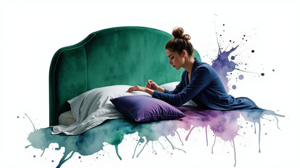
30 Fresh Bedroom Color Scheme Ideas to Inspire You in 2025
- oliverjames0609
- Dec 8, 2025
- 20 min read
Choosing a bedroom color scheme is one of the most impactful decisions in personalizing your home. The right palette does more than just decorate; it establishes a mood, influences sleep quality, and turns a simple room into a true sanctuary. Moving past fleeting trends and overwhelming choices, the goal is to find a combination that reflects your unique style and serves your daily need for rest and rejuvenation. But with a near-infinite spectrum of colors, finding the perfect starting point can feel paralyzing. This guide is designed to eliminate that uncertainty.
We've curated a comprehensive list of actionable bedroom color scheme ideas, each complete with a specific mood profile, popular paint color suggestions (including hex codes), and practical styling advice. You'll learn which furniture finishes best complement a moody blue, how to balance earthy terracotta with soft neutrals, and the secrets to making a monochromatic white feel warm and inviting.
This isn't just a gallery of inspiration; it's a practical toolkit. For every palette, we’ll provide do’s and don’ts and show you how to use Decor8 AI to instantly visualize these concepts in your own space, bridging the gap between idea and reality. Forget the guesswork and generic advice. Get ready to discover the perfect color story that will redefine your personal haven.
1. Serene Neutrals with Warm Accents
This timeless color scheme creates a sanctuary of calm by layering soft, muted neutrals as a base and introducing warmth through carefully chosen accent colors. The foundation relies on a sophisticated blend of warm grays, soft beiges, and creamy off-whites, establishing a tranquil and airy atmosphere. This approach, popularized by designers like Kelly Hoppen and brands like Restoration Hardware, is one of the most versatile bedroom color scheme ideas because it fosters relaxation without feeling sterile.
The magic lies in the accents. By incorporating touches of terracotta, soft rust, or burnished gold, the room gains personality and a cozy, inviting feel. These warm tones prevent the neutral palette from appearing cold or flat, adding depth and visual interest that draws you in.
The Palette
Primary: Soft Beige (Hex: #D8C3A5 / Benjamin Moore Muslin OC-12)
Secondary: Warm Gray (Hex: #CBC5C1 / Farrow & Ball Elephant's Breath No. 229)
Tertiary: Cream (Hex: #F7F3E3 / Sherwin-Williams Alabaster SW 7008)
Accent: Terracotta (Hex: #E2725B / Behr Terra Cotta Clay M210-6)
Accent: Warm Gold (Hex: #B59410 / Valspar Gilded Age 2008-2A)
Implementation & Key Considerations
To successfully execute this look, focus on texture and lighting. The goal is to create a multi-layered space that feels rich and sophisticated.
Layer Different Tones: Avoid a one-note look by using varying shades of beige and gray on walls, bedding, and rugs.
Incorporate Texture: Introduce tactile elements like a chunky knit throw, a linen headboard, Belgian flax curtains, or a bouclé accent chair to add depth.
Use Warm Lighting: Opt for light bulbs with a warm temperature (around 2700K) to enhance the cozy undertones of the paint and textiles.
Strategic Accents: Introduce terracotta or rust through pillows, a piece of artwork, or a single accent wall. Use warm metals like brass or copper for light fixtures, curtain rods, and decorative objects. For a deeper understanding of creating a relaxing atmosphere, you can learn more about elevating your bedroom design.
Pro Tip: Visualize your palette with Decor8 AI by uploading a photo of your room. Apply a warm gray to the walls and layer in a beige area rug and cream bedding. Then, test different terracotta accent pillows or a gold-framed mirror to see how the warmth balances the space before committing.
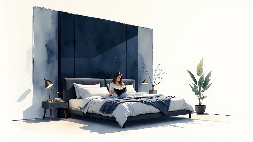
2. Moody Blues and Grays
This sophisticated palette creates an intimate, cocoon-like atmosphere by layering deep navy, slate blue, and charcoal gray. The result is a luxurious and calming sanctuary that feels both dramatic and deeply restful. Drawing inspiration from designers like David Hicks and brands such as Ralph Lauren Home, this is one of the boldest bedroom color scheme ideas, perfect for crafting a private escape that exudes modern elegance.
The depth of these cool tones envelops the space, making it feel cozy and secure, which can be highly conducive to sleep. The key to this scheme is balancing the dark, moody colors with lighter elements and reflective surfaces to prevent the room from feeling too heavy or closed-in. It’s a design choice that speaks of confidence and refined taste.
The Palette
Primary: Deep Navy (Hex: #000080 / Sherwin-Williams Naval SW 6244)
Secondary: Charcoal Gray (Hex: #36454F / Benjamin Moore Kendall Charcoal HC-166)
Tertiary: Slate Blue (Hex: #738290 / Behr Watery HDC-CT-26)
Accent: Soft Gold (Hex: #E4C580 / Clare Paint Good as Gold)
Accent: Crisp White (Hex: #FFFFFF / Behr Ultra Pure White PR-W15)
Implementation & Key Considerations
To master this dramatic look, focus on creating a balance between dark walls, bright accents, and thoughtful lighting. The goal is an upscale retreat, not a cave.
Brighten with Trim: Use a crisp white or soft cream for trim, ceilings, and doors. This contrast creates sharp, clean lines and keeps the deep colors from overwhelming the room.
Incorporate Metallics: Introduce accents in brushed gold, chrome, or silver through light fixtures, mirror frames, and hardware to add a touch of glamour and reflect light.
Warm Lighting is Key: Balance the cool-toned palette with warm lighting (2700K-3000K). This prevents the blues and grays from feeling sterile and enhances the cozy atmosphere.
Use Matte Finishes: Opt for matte or eggshell paint finishes on the walls. These non-reflective surfaces absorb light, which enhances the rich, velvety depth of the colors and adds to the intimate feel.
Pro Tip: Use Decor8 AI to test this palette confidently. Apply a deep navy like Naval to an accent wall behind your bed and a charcoal gray to the remaining walls. Then, experiment by adding a crisp white duvet, gold-accented nightstands, and a slate blue rug to see how these elements create a harmonious and sophisticated balance.
3. Soft Pastels (Blush, Lavender, Mint)
This dreamy and ethereal color scheme uses soft, desaturated hues like blush pink, gentle lavender, and pale mint green to create a whimsical yet calming atmosphere. Drawing inspiration from contemporary millennial design and brands like Urban Outfitters, this palette moves beyond traditional pastels by embracing muted tones that feel sophisticated and serene. It's one of the most expressive bedroom color scheme ideas for crafting a space that feels both personal and tranquil.
The beauty of this scheme lies in its ability to be playful without being overwhelming. By pairing these gentle colors with a neutral base, such as crisp white or light ivory, the room remains bright, airy, and grounded. This balance prevents the space from feeling overly sweet and instead fosters a chic, modern sanctuary with a soft, inviting energy.
The Palette
Primary: Blush Pink (Hex: #F1D4D4 / Benjamin Moore First Light 2102-70)
Secondary: Soft Lavender (Hex: #E6E6FA / Sherwin-Williams Silver Peony SW 6547)
Tertiary: Light Ivory (Hex: #FFF8E7 / Valspar Swiss Coffee 7002-16)
Accent: Mint Green (Hex: #BEE7E8 / Behr Minty Frost M420-1)
Accent: Pale Peach (Hex: #FFDAB9 / Farrow & Ball Pink Ground No. 202)
Implementation & Key Considerations
To create a sophisticated pastel bedroom, focus on balance, texture, and grounding elements. The key is to avoid a one-dimensional, juvenile look by layering colors and materials thoughtfully.
Choose a Dominant Pastel: Select one main pastel, like blush or lavender, for the walls or a major piece like the headboard, and use the others as smaller accents in pillows, art, or throws.
Ground with Neutrals: Use a clean ivory or soft white for trim, bedding, and curtains to keep the space feeling open and prevent the colors from clashing. Natural wood tones in furniture also add warmth and stability.
Introduce Varied Textures: Incorporate materials like velvet, linen, faux fur, or a chunky knit blanket to add depth and tactile interest, making the soft colors feel more luxurious.
Use Bright, Natural Lighting: Pastels thrive in well-lit spaces. Maximize natural light and use light bulbs with a neutral-to-cool temperature (3000K-4000K) to ensure the colors appear true and not muddied. If you're unsure which pastels work best together, you can find inspiration using a color scheme generator to explore harmonious combinations.
Pro Tip: Use the Decor8 AI visualizer to test a blush pink accent wall behind your bed. Layer in an ivory duvet and experiment with mint green and lavender pillows. See how a light oak nightstand or a brass lamp can ground the palette before you start painting.
4. Earthy Terracotta and Ochre
This grounding color scheme captures the warmth of sun-baked earth, creating a bedroom that feels both cozy and sophisticated. By blending rich terracotta, deep ochre, and warm browns with creamy neutrals, this palette evokes a connection to nature, drawing inspiration from Mediterranean villas and Southwestern landscapes. Popularized by brands like West Elm and Anthropologie, it's one of the most inviting bedroom color scheme ideas for those seeking a warm, bohemian, and stylish retreat.
The essence of this palette is its ability to be both vibrant and calming. The rich, earthy tones provide a comforting, cocoon-like atmosphere, while the creamy base keeps the space from feeling too dark or heavy. It’s a modern take on natural design that feels simultaneously rustic and refined.
The Palette
Primary: Terracotta (Hex: #C67258 / Sherwin-Williams Cavern Clay SW 7701)
Secondary: Cream (Hex: #F5F5DC / Benjamin Moore Navajo White OC-95)
Tertiary: Warm Brown (Hex: #8B4513 / Farrow & Ball Tanner's Brown No. 255)
Accent: Ochre/Mustard Yellow (Hex: #D4A017 / Behr Ochre M270-6)
Accent: Burnt Sienna (Hex: #E97451 / Valspar Burnt Sienna 2005-7C)
Implementation & Key Considerations
Successfully creating this earthy haven is all about balance and texture. The goal is to layer the warm tones without overwhelming the senses, letting natural materials shine.
Balance with Neutrals: Use cream or off-white for walls or large furniture pieces like the bed frame to provide a clean backdrop for the richer colors.
Incorporate Natural Materials: Enhance the earthy feel with wood nightstands, a jute rug, linen curtains, and rattan or cane furniture.
Add Greenery: Place live plants like a fiddle-leaf fig or snake plant in the room. The vibrant green creates a beautiful, natural contrast with the terracotta and ochre.
Mix Finishes: Combine matte finishes on the walls with the slight sheen of a ceramic vase or the rough texture of a woven throw to add visual depth and interest.
Warm Lighting: Use soft, warm lighting (2700K) to amplify the cozy, sun-drenched quality of the color palette.
Pro Tip: Use Decor8 AI to test this palette’s impact. Start with a cream wall color, then apply a terracotta shade to an accent wall behind the bed. You can then experiment with adding an ochre throw blanket and a jute rug to see how the layers of warmth and texture build a cohesive, inviting space.
5. Cool Emerald Green with Jewel Tones
This luxurious color scheme creates a dramatic and sophisticated retreat by using deep, cool emerald green as a commanding base, enriched with other vibrant jewel tones. The foundation is a rich, saturated green that evokes a sense of opulence and tranquility, often seen in high-end boutique hotels and editorial spreads. This approach, championed by designers like Ralph Lauren and featured in luxury design publications, is one of the more daring bedroom color scheme ideas, perfect for creating an immersive, high-end aesthetic.
The allure of this palette is in its bold yet harmonious combinations. Accenting emerald with sapphire blue, amethyst purple, or rich ruby adds layers of depth and personality, making the space feel curated and regal. These complementary jewel tones prevent the deep green from overwhelming the room, creating a balanced and visually stunning environment.
The Palette
Primary: Emerald Green (Hex: #046307 / Sherwin-Williams Billiard Green SW 0016)
Secondary: Sapphire Blue (Hex: #0F52BA / Benjamin Moore Starry Night Blue 2067-20)
Tertiary: Amethyst Purple (Hex: #9966CC / Behr Mystical Grape S110-6)
Accent: Creamy White (Hex: #F5F5DC / Farrow & Ball Wimborne White No. 239)
Accent: Polished Brass (Hex: #C19A6B / Metallic Finish)
Implementation & Key Considerations
To master this bold look, focus on balance, texture, and strategic lighting. The goal is to create a lavish space that feels intimate and sophisticated, not dark or heavy.
Balance with Neutrals: Use emerald on an accent wall behind the bed rather than all four walls. Incorporate creamy white or a very pale gray on remaining walls, trim, or the ceiling to lift the space and provide visual relief.
Incorporate Luxe Textures: This palette thrives on tactile richness. Introduce a velvet headboard, silk or satin pillows, a faux fur throw, or a leather armchair to amplify the luxurious feel.
Leverage Metallic Accents: Polished brass or gold is essential for this look. Use it for light fixtures, drawer pulls, mirror frames, and curtain rods to add warmth and a touch of glamour that cuts through the deep colors.
Use Warm, Dimmable Lighting: Soft, warm lighting (around 2700K) is crucial to enhance the richness of the jewel tones. Dimmers allow you to create an intimate, moody atmosphere in the evening.
Pro Tip: Use Decor8 AI to bring this opulent palette to life. Upload a photo of your bedroom and apply an emerald green to the wall behind your bed. Experiment with a sapphire blue velvet accent chair and amethyst pillows. Then, add a brass floor lamp to see how the metallic finish illuminates the deep, rich colors.
6. Monochromatic White and Off-White
This sophisticated color scheme builds a peaceful and airy retreat by layering various shades of white, from crisp optic white to soft ivories and warm creams. The foundation relies on a minimalist approach, creating a serene and spacious environment that prioritizes texture, form, and light over color. Popularized by the Scandinavian design movement and minimalist philosophies like those of Marie Kondo, this is one of the most elegant bedroom color scheme ideas for creating a clean, spa-like sanctuary.
The beauty of this palette is its subtle complexity. By combining different undertones and finishes, the room avoids feeling stark or clinical. The interplay of light on matte walls, a high-gloss trim, and soft linen bedding creates a dynamic yet tranquil space that feels both luxurious and calming.
The Palette
Primary: Pure White (Hex: #FFFFFF / Benjamin Moore Chantilly Lace OC-65)
Secondary: Soft Cream (Hex: #F5F5DC / Farrow & Ball White Tie No. 2002)
Tertiary: Light Ivory (Hex: #FFFFF0 / Sherwin-Williams Ivory Lace SW 7013)
Accent: Natural Wood (Varies, e.g., Light Oak or Ash)
Accent: Matte Black (Hex: #222222 / Behr Black S-H-790)
Implementation & Key Considerations
To master a monochromatic white scheme, the focus must shift from color to texture and light. The goal is to create a space that feels rich, layered, and intentionally designed.
Layer Different Whites: Combine whites with different undertones (e.g., a warm cream with a cooler, pure white) to create subtle depth and prevent a flat appearance.
Emphasize Texture: This is crucial. Incorporate a variety of materials like Belgian linen bedding, a chunky wool throw, sheer cotton curtains, and a bouclé armchair to add visual interest and a tactile quality.
Mix Finishes: Use different paint sheens to your advantage. A matte finish on walls provides a soft, non-reflective backdrop, while a satin or semi-gloss finish on trim and doors can catch the light and add definition.
Introduce Natural Elements: Incorporate light wood tones through a nightstand, bed frame, or flooring to add warmth and prevent the space from feeling sterile. A touch of black through a lamp or picture frame provides grounding contrast.
Pro Tip: Visualize this textured palette with Decor8 AI. Upload a photo of your bedroom and apply a soft cream to the walls. Experiment by adding a pure white linen duvet, an ivory rug, and a light oak nightstand to see how the subtle variations and textures create a cohesive and calming environment.
7. Soft Sage Green with Warm Neutrals
This nature-inspired color scheme fosters tranquility by blending soft sage green with a base of warm, earthy neutrals. The palette draws from the biophilic design movement, aiming to connect your personal space with the calming qualities of the natural world. By pairing muted gray-greens with creamy whites and soft beiges, this approach creates a bedroom that feels fresh, organic, and deeply restorative, a hallmark of designers embracing wellness-focused interiors.
The strength of this scheme is its ability to be both refreshing and cozy. The sage green provides a subtle hint of color that is inherently relaxing, while warm neutrals prevent the room from feeling too cool or stark. This balance makes it one of the most sophisticated bedroom color scheme ideas for creating a serene, modern, and inviting retreat.
The Palette
Primary: Soft Sage Green (Hex: #B2AC88 / Sherwin-Williams Evergreen Fog SW 9130)
Secondary: Muted Gray-Green (Hex: #CAD2C5 / Farrow & Ball Mizzle No. 266)
Tertiary: Cream (Hex: #F5F5DC / Benjamin Moore Swiss Coffee OC-45)
Accent: Warm Beige (Hex: #D8C3A5 / Behr Toasted Cashew N230-3)
Accent: Soft Brass (Hex: #C19A6B / No specific paint, for hardware/fixtures)
Implementation & Key Considerations
Successfully creating this botanical-inspired look hinges on balancing the green tones with natural textures and warm, ambient light.
Test Your Greens: Sage green can vary dramatically in different lighting. Test samples on multiple walls to see how they look in the morning, afternoon, and evening light before painting.
Incorporate Natural Materials: Pair the color palette with warm wood tones like oak or walnut for furniture. Enhance the organic feel with natural fibers such as linen curtains, a jute rug, or a rattan accent chair.
Layer Neutral Textiles: Use cream or warm white bedding as a crisp, clean base that makes the sage green walls pop. Add texture with a chunky beige knit throw or bouclé cushions.
Add Botanical Elements: Reinforce the nature-inspired theme with live plants like a snake plant or fiddle-leaf fig. Botanical prints in artwork can also tie the look together.
Pro Tip: Use Decor8 AI to visualize this palette. Upload a photo and apply a soft sage green to the walls. Experiment with a cream-colored upholstered headboard and an oak nightstand to see how the warm neutrals ground the green. Test adding brass lamps to introduce a touch of metallic warmth.
8. Romantic Deep Plum and Rose Gold
This elegant and luxurious color scheme creates a deeply romantic and sophisticated retreat. The foundation is a rich, moody plum or eggplant purple, which establishes a sense of intimacy and drama. When paired with the soft, metallic sheen of rose gold and delicate blush pink accents, the palette strikes a perfect balance between opulence and modern femininity. This combination, often seen in high-end boutique hotels and celebrated by publications like Elle Decor, is one of the most glamorous bedroom color scheme ideas for those seeking a bold yet inviting atmosphere.
The key to this palette is the interplay between the deep, saturated primary color and the light-reflecting metallics. The plum provides a cozy, enveloping feel, while rose gold and cream introduce brightness and a touch of vintage-inspired charm, preventing the darker tones from overpowering the space.
The Palette
Primary: Deep Plum (Hex: #59355B / Sherwin-Williams Darkroom SW 7083)
Secondary: Blush Pink (Hex: #F1D4D4 / Benjamin Moore First Light 2102-70)
Tertiary: Cream (Hex: #FFFDD0 / Valspar Swiss Coffee 7002-16)
Accent: Rose Gold (Hex: #B76E79 / Metallic Paint Finish)
Accent: Soft Gray (Hex: #D0CFCF / Farrow & Ball Blackened No. 2011)
Implementation & Key Considerations
To master this dramatic look, focus on balancing light, texture, and metallic finishes. The goal is a space that feels both intimate and luminous.
Strategic Color Placement: Use deep plum on a single accent wall behind the bed to create a focal point without overwhelming the room. Paint the remaining walls a soft cream or blush to maintain brightness.
Incorporate Luxe Textures: Introduce tactile fabrics like a velvet headboard, satin sheets, or a faux fur throw to enhance the sense of luxury and comfort.
Use Rose Gold Wisely: Integrate rose gold through light fixtures, drawer pulls, mirror frames, and decorative objects. For a subtle yet modern touch, consider how rose gold wall stickers as a modern decor colour can add metallic flair without permanent changes.
Layered Lighting: Employ warm, dimmable lighting to control the mood. Table lamps with cream or blush shades will cast a soft, flattering glow that complements the rich wall color.
Pro Tip: Use Decor8 AI to visualize the impact of a plum accent wall. Upload a photo of your bedroom, apply a deep plum color, and then experiment with a cream-colored duvet and rose gold light fixtures to see how the elements create a balanced, high-end look before you start painting.
9. Warm Gray with Warm Accent Colors
This sophisticated palette offers a contemporary twist on neutral design, using warm gray, often called "greige," as a versatile and enveloping base. The scheme achieves a perfect balance between the coolness of gray and the warmth of beige, creating a backdrop that is both modern and comforting. Esteemed paint brands like Benjamin Moore and Sherwin-Williams have popularized this look, demonstrating its power to craft serene yet dynamic spaces.
The true appeal of this approach comes from layering in vibrant, warm accent colors. By introducing notes of peachy coral, rich burgundy, or warm orange, the room gains energy and personality. This combination is one of the most adaptable bedroom color scheme ideas because it provides a refined, calming foundation that can be easily invigorated with personal touches, preventing the space from feeling monotonous.
The Palette
Primary: Warm Gray (Hex: #BEB8B1 / Benjamin Moore Revere Pewter HC-172)
Secondary: Taupe (Hex: #A99985 / Sherwin-Williams Accessible Beige SW 7036)
Tertiary: Soft White (Hex: #F5F4F0 / Behr Polar Bear 75)
Accent: Coral (Hex: #FF7F50 / Valspar Coral Peach 2005-2A)
Accent: Burgundy (Hex: #800020 / Farrow & Ball Eating Room Red No. 43)
Implementation & Key Considerations
Success with this palette hinges on balancing the neutral base with carefully selected warm accents and complementary textures.
Test Paint Samples: Greige and taupe can shift dramatically depending on the light. Test multiple paint samples on your walls and observe them at different times of the day to find the perfect shade for your room's specific lighting conditions.
Warm Textiles: Infuse warmth through textiles. Consider a burgundy velvet headboard, coral throw pillows, or a warm orange patterned rug to add both color and tactile richness.
Incorporate Natural Wood: Warm wood tones are a natural partner for this palette. A walnut nightstand, oak flooring, or a teak accent chair will enhance the cozy, organic feel of the space.
Strategic Color Pops: Use your accent colors intentionally. A single piece of coral artwork, a collection of peachy-toned vases, or a burgundy throw blanket at the foot of the bed can make a powerful statement without overwhelming the room.
Pro Tip: Use Decor8 AI to find the right balance. Upload a photo of your bedroom and apply a warm gray like Revere Pewter to the walls. Then, experiment with different accent colors. Test a burgundy accent chair versus coral pillows to see which pop of color best complements your existing furniture and natural light.
10. Soft Blue and White with Navy Accents
This classic color scheme creates a serene and timeless retreat by pairing soft, airy blue with crisp white and grounding it with deep navy accents. The foundation is a gentle, pale blue that promotes tranquility and restfulness, establishing a calm, coastal-inspired atmosphere. This approach, heavily popularized by brands like Ralph Lauren and Pottery Barn, is one of the most enduring bedroom color scheme ideas because it feels both fresh and sophisticated.
The elegance of this palette comes from its balanced contrast. The crisp white elements, like trim and linens, cut through the softness of the blue, creating a clean and bright look. The introduction of navy adds a layer of depth and maturity, preventing the room from feeling overly juvenile and adding a touch of classic, preppy style.
The Palette
Primary: Soft Blue (Hex: #B0C4DE / Sherwin-Williams Sleepy Blue SW 6225)
Secondary: Crisp White (Hex: #FFFFFF / Benjamin Moore Chantilly Lace OC-65)
Tertiary: Navy Blue (Hex: #000080 / Farrow & Ball Stiffkey Blue No. 281)
Accent: Light Wood Tone (Hex: #D2B48C / Minwax Natural Wood Stain)
Accent: Brass (Hex: #D4AF37 / Hardware Finish)
Implementation & Key Considerations
To master this look, focus on creating a harmonious balance between the light and dark tones while incorporating natural textures.
Walls and Trim: Use the soft blue on the walls to create an expansive, airy feel. Paint the trim, doors, and ceiling in crisp white to make the blue pop and enhance the room's brightness.
Layer Blue Tones: Introduce navy through a duvet cover, throw pillows, an upholstered headboard, or a rug. This creates visual depth without overwhelming the space.
Incorporate Warmth: Balance the cool tones with natural elements. A light oak bed frame, wicker baskets, or a jute rug can prevent the room from feeling cold.
Strategic Accents: Use brass or another warm metal for curtain rods, drawer pulls, and light fixtures. This adds a touch of sophistication and warmth. For more inspiration on creating this look, you can learn more about how to bring a seaside feel to your space.
Pro Tip: Visualize this classic palette with Decor8 AI. Upload a photo of your bedroom and apply a soft blue paint to the walls with white trim. Experiment with a navy upholstered headboard and a light wood nightstand to see how the elements work together before you purchase anything.
Top 10 Bedroom Color Schemes Comparison
Palette | 🔄 Implementation complexity | ⚡ Resource requirements | 📊 Expected outcomes | 💡 Ideal use cases | ⭐ Key advantages |
|---|---|---|---|---|---|
Serene Neutrals with Warm Accents | 🔄 Low–Moderate — simple palette + strategic accents | ⚡ Low — paint, warm lighting, accent metals | 📊 Calm, cozy, sleep-promoting | 💡 Relaxing bedrooms, timeless interiors | ⭐ Versatile, hides wear, timeless aesthetic |
Moody Blues and Grays | 🔄 Moderate — needs lighting and accent balance | ⚡ Moderate — deep paint, metallic accents, lighting | 📊 Intimate, luxurious, calming (may reduce perceived size) | 💡 Upscale, modern bedrooms or private sanctuaries | ⭐ Sophisticated, hides imperfections, restful |
Soft Pastels (Blush, Lavender, Mint) | 🔄 Low — easy to apply but needs careful pairing | ⚡ Low — paint and textiles; higher upkeep for stains | 📊 Airy, dreamy, can feel juvenile or dated if misused | 💡 Small rooms, contemporary or feminine designs | ⭐ Visually expands space, easy to refresh |
Earthy Terracotta and Ochre | 🔄 Moderate — requires balance to avoid overwhelm | ⚡ Moderate — paints, natural materials, textures | 📊 Warm, grounding, cozy and timeless | 💡 Bohemian, rustic, nature-connected bedrooms | ⭐ Timeless appeal, complements natural materials |
Cool Emerald Green with Jewel Tones | 🔄 High — bold choice needing careful scale & lighting | ⚡ High — rich paint, luxe textiles, metallic hardware | 📊 Dramatic, luxurious, high-impact (can feel heavy) | 💡 Luxury, statement bedrooms, design-forward homes | ⭐ Distinctive, upscale, photogenic |
Monochromatic White and Off-White | 🔄 Moderate — texture layering and finish choices matter | ⚡ Moderate — varied textiles, finishes; ongoing maintenance | 📊 Serene, spacious, minimalist (can feel clinical if flat) | 💡 Minimalist, spa-like, small spaces needing brightness | ⭐ Maximizes light, extremely versatile, timeless |
Soft Sage Green with Warm Neutrals | 🔄 Moderate — undertone testing recommended | ⚡ Low–Moderate — paint samples, plants, natural fibers | 📊 Biophilic, calming, fresh and approachable | 💡 Wellness-focused, contemporary or traditional rooms | ⭐ Nature-connected, pairs well with plants and wood |
Romantic Deep Plum and Rose Gold | 🔄 High — needs deliberate balance and lighting | ⚡ Moderate–High — deep paint, metallics, luxe textiles | 📊 Romantic, intimate, luxurious (risk of darkness) | 💡 Boutique, romantic or high-end bedroom schemes | ⭐ Unique, elegant, flattering in photos |
Warm Gray with Warm Accent Colors | 🔄 Moderate — greige selection requires testing | ⚡ Low–Moderate — paint samples, warm textiles | 📊 Balanced, contemporary, cozy without boldness | 💡 Transitional spaces, current interiors seeking warmth | ⭐ Versatile middle ground, prevents cool gray sterility |
Soft Blue and White with Navy Accents | 🔄 Low — straightforward classic scheme | ⚡ Low — paints, crisp linens, navy accents | 📊 Fresh, airy, universally calming | 💡 Coastal, traditional, timeless bedroom designs | ⭐ Timeless, universally calming, easy to coordinate |
From Inspiration to Implementation: Your Next Steps
You've explored a comprehensive portfolio of bedroom color scheme ideas, from the tranquil embrace of soft sage green to the dramatic allure of deep plum and rose gold. We've deconstructed palettes, examined their psychological impact, and provided practical tips for pairing them with furniture, lighting, and decor. The journey from a page of inspiration to a beautifully realized room, however, requires a deliberate and thoughtful transition.
The most powerful takeaway is that color is more than just pigment on a wall; it's the foundation of your personal sanctuary. It dictates the mood, influences your sleep, and sets the stage for every other design choice you make. The difference between a good bedroom and a great one often lies in the confidence with which a color scheme is executed.
Bridging the Gap Between Concept and Reality
Before you commit to a single hue, it's essential to move beyond abstract concepts and into practical application. The perfect color on a screen or a tiny paint chip can look surprisingly different when applied across four walls, influenced by the unique lighting and architecture of your space. This is where the real work of a designer begins.
Think back to the core principles we discussed:
Lighting is Paramount: Remember how a moody blue can feel sophisticated in a room with ample natural light but potentially confining in a darker space? Always test your chosen colors on different walls and observe them at various times of the day.
Balance is Key: A monochromatic white scheme feels chic, not sterile, because of the careful layering of textures. An earthy terracotta palette feels grounded, not overwhelming, when balanced with lighter neutrals and natural materials.
Personalization is Everything: The ultimate goal is to create a space that feels uniquely yours. Does a soft pastel palette align with your desire for a serene retreat, or does the energy of emerald green better suit your personality? Your emotional response to a color is the most important factor.
Your Actionable Blueprint for Success
Feeling inspired is wonderful, but feeling empowered to act is even better. Here is a clear, step-by-step plan to turn your favorite bedroom color scheme ideas into a tangible reality.
Shortlist Your Top Three: Revisit the list and select the two or three palettes that resonated most deeply with you. Don't overthink it; trust your initial gut reaction.
Create a Mood Board: For each shortlisted scheme, gather physical or digital samples. Collect paint chips, fabric swatches (for bedding and curtains), and images of wood tones or metal finishes you plan to use. This helps you see how all the elements interact.
The Visualization Test (The Most Crucial Step): This is the modern, risk-free alternative to painting countless sample swatches on your wall. Use a tool like Decor8 AI to upload a photo of your actual bedroom. In seconds, you can virtually "paint" your walls with the exact palettes we’ve discussed. See for yourself how that warm gray interacts with your headboard or how that soft blue looks with your floorboards. This step single-handedly removes the guesswork and prevents costly mistakes.
Refine and Finalize: After visualizing, one color scheme will likely emerge as the clear winner. Now you can confidently purchase your paint, plan your decor, and begin the transformation. A well-chosen color palette is the cornerstone of a cohesive room; for a holistic approach to transforming your space, explore additional luxury bedroom design ideas that complement your chosen color scheme.
By following this process, you are no longer just choosing a color; you are designing an experience. You are crafting a retreat that supports your well-being, reflects your style, and welcomes you home each day. Your dream bedroom is not just a possibility; it's a project waiting to happen.
Ready to stop guessing and start visualizing? Take the next step with Decor8 AI. Upload a photo of your bedroom and instantly apply any of these color schemes to your own walls, seeing the final result before you even buy a sample pot. Visit Decor8 AI to transform your inspiration into a confident design plan today.
Comments