10 Timeless Trim Color Ideas for a White House in 2026
- oliverjames0609
- 15 hours ago
- 17 min read
A white house is a timeless canvas, offering endless possibilities for architectural expression. However, the true character of a white exterior is often defined not by the main color, but by its trim. The right trim color acts as the perfect frame, elevating a simple facade into a stunning statement, highlighting architectural details, and significantly boosting curb appeal. But choosing that perfect shade, one that complements your home's unique style, lighting, and landscape, can be a daunting task.
This guide moves beyond generic advice to provide 10 distinct and actionable trim color ideas for a white house. We will explore specific palettes, offer paint brand suggestions, and provide professional tips for achieving a cohesive look. We'll examine how each color choice creates a different mood, from the crisp, high-contrast drama of black to the subtle, nature-inspired calm of sage green. You will learn how to select a color that not only looks great but also enhances your home’s best features.
While paint offers a static frame during the day, consider a dynamic approach with a professional trim lighting installation to emphasize your home's architectural details day and night.
To make your final decision even easier, we will also discuss how you can use powerful visualization tools like Decor8 AI to preview these colors on your actual home. This ensures you can confidently make a choice you will love for years to come. Let's dive into the palettes that will perfectly frame your home's beauty.
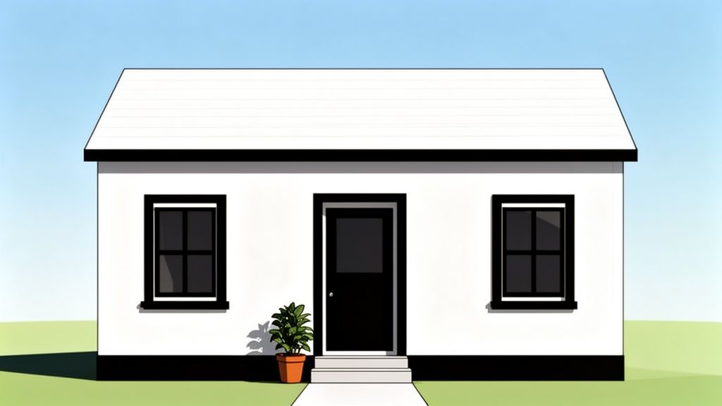
1. Classic Crisp White (Matching Trim)
Opting for a crisp white trim that perfectly matches your home's main exterior color is a bold statement in simplicity. This monochromatic trim color idea for a white house creates a seamless, unified facade that feels both modern and timeless. By eliminating contrast, the focus shifts entirely to the home's architectural form, celebrating its lines, shadows, and textures. It’s an ideal choice for minimalist, contemporary, and modern farmhouse designs where clean, uninterrupted surfaces are key.
Why It Works
This approach enhances architectural details through light and shadow rather than color. The subtle play of sunlight across the facade creates depth and interest, making geometric shapes and unique structural elements stand out. This all-white scheme evokes a sense of pristine elegance and sophisticated calm, turning your home into a sleek, sculptural object. For those leaning into a truly cohesive look, exploring the best off-white paint colors can add subtle depth while maintaining a classic aesthetic.
Implementation Tips
To successfully execute this look without it appearing flat, consider these strategies:
Vary the Sheen: Use a matte or eggshell finish for the main siding and a semi-gloss or satin finish for the trim. This subtle difference in reflectivity catches the light differently, defining the trim without using a different color.
Focus on Texture: This style shines on homes with varied exterior textures, such as board-and-batten siding, stucco, or architectural panels. The uniform color highlights these textural differences.
Lighting is Key: Invest in high-quality exterior lighting. Well-placed sconces, uplighting, and landscape lights will create dramatic shadows at night, adding dimension and preventing the home from looking one-dimensional.
Visualize First: Use a tool like Decor8 AI to see how different white tones will interact with your home's specific lighting conditions and architectural style. This helps you choose the perfect white and preview the final look before you commit.
2. Black Trim (High Contrast Statement)
Pairing a white house with black trim is a powerful trim color idea that creates a dramatic, high-contrast look rooted in modern sophistication. This striking combination sharply defines a home's architectural lines, making windows, doors, and rooflines pop with graphic precision. Popularized by the modern farmhouse movement and seen in high-end contemporary designs, this bold choice is perfect for homeowners looking to make a confident and stylish statement.
Why It Works
The stark contrast between black and white provides instant visual impact and enhances curb appeal. Black trim acts like a frame, drawing attention to architectural features and creating a clean, crisp silhouette. This combination is incredibly versatile, fitting seamlessly with minimalist, industrial, and modern farmhouse aesthetics. It feels both current and classic, ensuring your home looks chic and well-defined for years to come.
Implementation Tips
To achieve a polished and intentional high-contrast look, consider the following:
Test Undertones: Not all blacks are the same. Test a true black like Sherwin-Williams Tricorn Black, a soft charcoal like Benjamin Moore Iron Mountain, or even a black with a hint of navy to find the perfect match for your home's white paint and lighting.
Material Matters: Black trim looks especially sharp on modern window frames (vinyl or metal), fascia boards, and front doors. Using a satin or semi-gloss finish will give the trim a subtle sheen that distinguishes it from the siding.
Balance with Lightness: To prevent the look from feeling too heavy, balance black accents with light-colored landscaping, such as light gray pavers or white gravel. Warm wood elements, like a porch ceiling or columns, can also soften the contrast.
Visualize the Impact: The effect of black trim can be dramatic. Use a tool like Decor8 AI to upload a photo of your home and instantly see how black trim will look on your specific architecture. This allows you to test the visual weight and balance before you even pick up a paintbrush.
3. Soft Gray Trim (Subtle Contrast)
A soft gray trim offers a sophisticated, understated contrast against a white house, striking a perfect balance between a monochromatic scheme and a high-contrast look. This trim color idea for a white house provides just enough visual separation to highlight architectural features like windows, eaves, and doorways without overwhelming the facade. It's an incredibly versatile choice that complements a wide range of styles, from traditional Cape Cod and colonial homes to modern transitional designs.
Why It Works
Gray trim introduces a layer of depth and quiet elegance. Unlike the starkness of black, a light or medium gray feels softer and more approachable, creating a serene and welcoming exterior. It beautifully picks up on natural materials like stone, slate roofing, or metal accents, creating a cohesive and harmonious palette. This subtle contrast makes the home appear well-defined and thoughtfully designed, enhancing its curb appeal with a touch of classic refinement.
Implementation Tips
To achieve a polished and intentional look with gray trim, consider the following:
Mind the Undertones: Grays can have warm (greige), cool (blue-gray), or neutral undertones. Test samples against your specific white siding to see how they interact in different lighting conditions throughout the day.
Coordinate with Roofing: A gray trim color looks particularly cohesive when it matches or complements the color of your roof shingles or metal roofing.
Vary the Shade: Don't be afraid to test multiple gray values. A very light gray offers a whisper of contrast, while a medium charcoal gray provides a more grounded, substantial frame for your home’s features.
Visualize with Context: It's crucial to see how your chosen gray interacts with your entire exterior. Use a tool like Decor8 AI to visualize different gray shades on your trim, ensuring the final choice harmonizes with your home’s siding, roof, and even landscaping elements before you paint.
4. Warm Taupe or Greige Trim (Sophisticated Neutral)
For a look that exudes quiet luxury and warmth, consider a warm taupe or greige trim. This sophisticated neutral pairing moves beyond the standard high-contrast options, offering a subtle, earthy frame for a white house. By blending the softness of beige with the modern edge of gray, greige and taupe create a trim color idea for a white house that feels both grounded and refined. This choice bridges the gap between traditional and contemporary styles, making it exceptionally versatile for transitional, Mediterranean, and European-inspired homes.
Why It Works
This combination adds depth and character without overwhelming the primary white siding. The warm undertones in taupe and greige complement natural materials beautifully, such as stone accents, wood garage doors, or copper gutters. It creates an inviting, gallery-like effect that feels curated and high-end. This palette is particularly effective for homes with warm off-white siding, preventing the trim from looking stark while still providing elegant definition to architectural features like eaves, window frames, and columns.
Implementation Tips
To achieve a polished and cohesive look with this trim color, follow these guidelines:
Match Undertones: Ensure the undertone of your chosen taupe or greige complements the undertone of your white siding. A warm white pairs best with a warm-toned greige to avoid a clashing, muddy appearance.
Coordinate with Hardscaping: This color shines when it harmonizes with existing elements like a slate roof, stone pathways, or warm-toned brick. The trim should act as a bridge between the house and its landscape.
Test in All Lights: Taupe and greige are notoriously chameleon-like colors. Test large swatches on different sides of your home to see how they appear in the bright morning sun versus the soft evening glow.
Use Visualizers for Precision: Before committing, use a tool like Decor8 AI to visualize how different shades of taupe and greige interact with your home's specific white paint and surrounding environment. This helps you preview the final curb appeal with confidence.
5. Navy Blue Trim (Nautical Sophistication)
Choosing a deep navy blue trim for a white house injects a dose of nautical sophistication and timeless elegance. This rich, classic hue offers a compelling alternative to black, providing sharp, defining contrast without the starkness. A navy blue trim color idea for a white house feels both traditional and fresh, evoking images of coastal estates and stately colonial homes. It creates a distinguished and inviting look that balances personality with understated class, making it a versatile choice for a wide range of architectural styles.
Why It Works
Navy blue trim provides strong definition and visual interest while adding a layer of color and warmth that black often lacks. The deep blue tones harmonize beautifully with the crispness of a white facade, creating a palette that is both striking and serene. This color combination is highly effective in coastal, New England colonial, and modern farmhouse designs, as it adds character and a sense of established charm. It suggests a connection to tradition and quality, elevating the home's overall curb appeal.
Implementation Tips
To ensure your navy trim achieves a sophisticated look rather than appearing too dark, consider these strategies:
Mind the Undertones: Navy blues can range from deep, almost-black indigos to brighter, more saturated royals. Test different shades on-site, as the natural light will significantly impact how the color appears throughout the day.
Pair with Warm Accents: Complement the cool navy tones with warm metallic hardware, such as brass or bronze, on doors, light fixtures, and house numbers. This creates a balanced and luxurious feel.
Focus on Key Features: Start by painting the front door or window sashes in navy to see how you like the effect. This allows you to introduce the color strategically before committing to all trim elements.
Utilize Decor8 AI: Visualize how different navy shades like Sherwin-Williams' Naval (SW 6244) or Benjamin Moore's Hale Navy (HC-154) will pair with your specific white siding. This tool helps you see the contrast and balance before painting.
6. Charcoal Gray Trim (Modern Depth)
Striking a perfect balance between the subtlety of light gray and the starkness of black, charcoal gray trim offers a sophisticated, high-contrast look for a white house. This modern trim color idea creates sharp architectural definition without the potential harshness or high maintenance of pure black. It provides visual weight and depth, grounding the home's design while maintaining a sleek, contemporary feel. Charcoal is an incredibly versatile choice, complementing everything from modern farmhouses to mid-century modern and transitional-style homes.
Why It Works
Charcoal gray adds a layer of drama and elegance that enhances a home's curb appeal. It creates a crisp, clean outline that makes architectural features like window frames, eaves, and doorways pop against the white siding. This color combination feels intentional and curated, signaling a modern design sensibility. Unlike black, which can absorb heat and show dust more readily, charcoal is a more forgiving and practical option that still delivers a powerful visual punch.
Implementation Tips
To achieve a polished, modern look with charcoal gray trim, consider the following:
Test Undertones: Charcoal grays can have cool (blue-green) or warm (brown) undertones. Test samples next to your white siding to see which complements it best. A cool charcoal like Benjamin Moore's "Kendall Charcoal" offers a crisp look, while a warmer one like Sherwin-Williams' "Iron Ore" feels more organic.
Coordinate with Other Elements: Ensure your charcoal trim harmonizes with other exterior elements like the roof color, stone or brick accents, and garage doors. A cohesive palette is key to a high-end finish.
Use on Accent Features: Beyond just the trim, consider using charcoal on the front door, shutters, or even a metal roof accent to create a unified and impactful design statement.
Visualize the Contrast: Use a tool like Decor8 AI to compare different shades of charcoal against your specific white siding. This allows you to visualize how the contrast level will appear in various lighting conditions and helps you select the perfect depth of gray for your home's unique style.
7. Forest Green Trim (Nature-Inspired Accent)
Introducing a deep forest green trim is a fantastic way to ground a white house in its natural surroundings. This nature-inspired accent offers a sophisticated and timeless alternative to more common neutrals, providing a rich, organic feel. Drawing from historical precedent seen in Colonial and cottage-style homes, this trim color idea for a white house connects the structure to the landscape, creating a harmonious and welcoming facade. It’s perfect for homeowners who want to add personality and depth without the stark contrast of black.
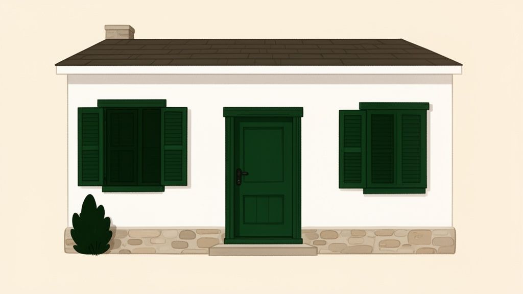
Why It Works
Forest green evokes a sense of tradition, stability, and calm. This color complements the crispness of a white exterior by adding warmth and character, making the home feel established and inviting. It works exceptionally well in wooded areas or properties with lush gardens, as the green trim beautifully echoes the foliage. This pairing is versatile, suiting architectural styles from classic Colonial and historic New England homes to modern farmhouses and cozy cottages seeking a touch of earthy elegance.
Implementation Tips
To ensure your forest green trim enhances your home's appeal, follow these guidelines:
Select the Right Undertone: Test different shades like hunter, emerald, or olive-toned forest greens. The right one will complement your home's specific white, as well as any existing stone or brick accents.
Coordinate with the Landscape: Choose a green that harmonizes with your garden and surrounding trees. The goal is to create a seamless visual connection between your home and its environment.
Start Small for Big Impact: If you're hesitant to commit to all-over green trim, start by painting the front door and shutters. This can provide a powerful focal point and give you a feel for the color combination.
Visualize in Context: Use a tool like Decor8 AI to see how different forest green shades look against your white siding in various lighting conditions. This allows you to test options and stage them with digital landscaping to see the complete, intended effect before painting.
8. Warm Bronze or Copper Trim (Metallic Luxury)
Introducing warm bronze or copper as a trim color idea for a white house infuses the exterior with an immediate sense of upscale, contemporary luxury. This choice moves beyond traditional paint colors, using metallic tones to add warmth, reflection, and sophistication. It’s a perfect fit for window frames, doors, gutters, and hardware-focused details where the metallic sheen can truly shine. This trend aligns with interior design’s shift towards warmer metals, creating a cohesive and high-end feel from the curb to the interior.
Why It Works
The magic of bronze and copper trim lies in its dynamic quality. Unlike a flat paint color, a metallic finish interacts with sunlight, changing its appearance throughout the day and casting a warm, inviting glow. This creates incredible visual depth and prevents a white exterior from feeling too stark or cold. It’s an ideal choice for transitional, modern, and eclectic homes aiming to blend timeless architecture with a forward-thinking, luxurious aesthetic. This look signals a high attention to detail and a curated design sensibility.
Implementation Tips
To get the most out of this sophisticated palette, focus on precise application and coordination:
Strategic Placement: Reserve metallic finishes for key architectural elements like front doors, window sashes, garage doors, or high-end gutters. This creates impactful focal points without overwhelming the design.
Coordinate Hardware: Ensure that exterior light fixtures, house numbers, and door handles are finished in a complementary bronze or copper tone to create a unified, professionally designed look.
Test Sheen Levels: Metallic paints come in various sheens, from a subtle matte to a reflective semi-gloss. Test samples on-site to see how they interact with your home’s specific lighting conditions.
Visualize the Glow: Use a tool like Decor8 AI to simulate how bronze or copper trim will look at different times of day. Visualizing the effect of both morning sun and evening landscape lighting is crucial for getting the warm, luxurious glow just right.
9. Soft Sage or Gray-Green Trim (Calming Contemporary)
Choosing a soft sage or gray-green trim is a sophisticated trim color idea for a white house that evokes a sense of calm and a deep connection to nature. This muted, earthy tone provides a gentle contrast that is both contemporary and timeless, moving away from stark contrasts to create a more organic, serene facade. It's an ideal choice for modern farmhouses, transitional cottages, and contemporary homes that emphasize wellness and an indoor-outdoor living philosophy.
Why It Works
This color pairing harmonizes beautifully with natural surroundings, making the home feel like a seamless part of its landscape. The gray undertones in sage green prevent it from feeling overly bright, lending it an elegant and understated quality that enhances architectural details without overpowering them. This combination feels fresh, modern, and grounded, reflecting a growing trend toward biophilic design that brings natural elements into our living spaces for a restorative effect.
Implementation Tips
To ensure your sage green trim achieves a calming, contemporary feel, follow these guidelines:
Test Undertones: Sage greens can lean warm (more yellow-green) or cool (more gray-blue). Sample different options to see which best complements your home’s specific white paint and the natural light it receives.
Coordinate with Landscaping: This color shines when it echoes the greens in your garden. Consider how the trim will look alongside your trees, shrubs, and lawn for a cohesive, intentional design.
Use an AI Visualizer: Before committing, use a tool like Decor8 AI to upload a photo of your home and test various sage and gray-green shades. This allows you to see how different undertones interact with your home's unique features and lighting conditions.
Balance with Finishes: Pair sage green trim with natural materials like wood accents, stone pathways, or copper gutters to enhance the organic aesthetic. A satin finish on the trim provides a subtle sheen that defines the lines without being overly glossy.
10. Deep Burgundy or Wine Trim (Bold Classic Statement)
Choosing a deep burgundy or wine-colored trim for a white house is a powerful move that conveys heritage, confidence, and sophisticated warmth. This rich, historical hue provides a dramatic yet elegant contrast, adding depth and character to the facade. It is a stunning trim color idea for a white house, especially for traditional, Colonial, and Federal-style homes where it feels both authentic and commanding. This choice moves beyond common neutrals to create a memorable and upscale exterior.
Why It Works
A burgundy trim draws the eye to architectural features like shutters, doors, and window casings, framing them with a rich, velvety color that white siding makes pop. The combination feels classic and grounded, evoking a sense of established elegance and timeless appeal. Unlike brighter reds, deep wine tones are subdued enough to remain tasteful while still providing a significant visual impact. This color pairing works exceptionally well on homes with brick accents or traditional landscaping, tying the whole scheme together.
Implementation Tips
To ensure this bold choice enhances your home without overwhelming it, follow these guidelines:
Test Undertones: Sample various shades before committing. A warm, brown-based burgundy offers a rustic feel, while a cooler, purple-based wine color feels more formal and contemporary.
Strategic Placement: For a balanced look, consider using burgundy on the front door and shutters, while keeping window frames and fascia in a crisp white or soft off-white. This prevents the color from feeling too heavy.
Mind Your Lighting: This color looks best on homes that receive ample natural light. In heavily shaded areas, a dark burgundy can appear almost black, losing its rich undertones.
Visualize the Impact: Use a tool like Decor8 AI to see how different burgundy shades will look on your specific home. This is crucial for visualizing how the color interacts with your roof, stone or brick accents, and landscaping throughout the day.
10 Trim Color Options for White Houses
Trim Style | 🔄 Implementation Complexity | ⚡ Resources & Maintenance | ⭐ Expected Outcomes | 📊 Ideal Use Cases | 💡 Key Advantages / Tips |
|---|---|---|---|---|---|
Classic Crisp White (Matching Trim) | Low — standard paintwork; minimal color decisions | Low — common whites, easy touch-ups; shows dirt more | ⭐⭐⭐⭐ — bright, timeless, seamless look | Contemporary, minimalist, modern farmhouses | Use Decor8 AI to preview shadows; add lighting or texture to avoid flatness |
Black Trim (High Contrast Statement) | Medium — precise application; consider light balance | Medium-high — shows dust/water spots; more frequent cleaning | ⭐⭐⭐⭐ — dramatic curb appeal and definition | Modern farmhouse, luxury, high-contrast designs | Test black undertones; start on windows/doors; ensure adequate natural light |
Soft Gray Trim (Subtle Contrast) | Low–Medium — straightforward paint; careful shade choice | Medium — widely available; hides dirt better than white | ⭐⭐⭐⭐ — versatile, polished, restrained contrast | Transitional, colonial revival, coastal | Use Decor8 AI to test undertones and time-of-day lighting |
Warm Taupe / Greige Trim (Sophisticated Neutral) | Medium — undertone matching required | Medium — some shades limited; good at hiding wear | ⭐⭐⭐⭐ — warm, elegant, timeless | Luxury suburban, Mediterranean, warm-toned homes | Sample in situ; match to roof, stone, and landscaping |
Navy Blue Trim (Nautical Sophistication) | Medium — palette coordination and undertone testing | Medium — shows debris similar to black; moderate availability | ⭐⭐⭐⭐ — strong definition without harshness | Coastal, colonial, upscale suburban properties | Try navy on doors/windows first; test multiple navy undertones |
Charcoal Gray Trim (Modern Depth) | Medium — undertone selection and balance with light | Medium — easier upkeep than true black; widely available | ⭐⭐⭐⭐ — modern, dramatic yet forgiving | Contemporary, mid-century modern, modern farmhouse | Compare charcoal vs black/gray in Decor8 AI; test warm vs cool undertones |
Forest Green Trim (Nature-Inspired Accent) | Medium — requires landscape and historic coordination | Medium — may be limited in some lines; moderate maintenance | ⭐⭐⭐⭐ — rich, traditional, nature-linked | Colonial, cottage, historic New England homes | Coordinate with plantings; test greens on shutters/doors first |
Warm Bronze / Copper Trim (Metallic Luxury) | High — finish selection and professional application advised | High — specialty finishes, coordinate with hardware/interiors | ⭐⭐⭐⭐ — luxurious, dynamic (changes with light) | High-end transitional, luxury modern, designer properties | Visualize metallics across times of day; use as accents; test finishes (matte/satin) |
Soft Sage / Gray-Green Trim (Calming Contemporary) | Low–Medium — subtle selection; careful undertone choice | Medium — trending but generally available; lower maintenance than dark trims | ⭐⭐⭐⭐ — calming, nature-inspired, approachable | Wellness-focused, contemporary cottages, modern farmhouses | Sample in natural daylight; try on accents before full trim |
Deep Burgundy / Wine Trim (Bold Classic Statement) | Medium — undertone precision important to avoid unwanted casts | Medium — availability moderate; maintenance similar to dark trims | ⭐⭐⭐⭐ — bold, historic, sophisticated statement | Historic colonial, federal-style, traditional period homes | Limit to doors/shutters or accents; test burgundy undertones and lighting effects |
Visualize Your Vision: From Inspiration to Implementation
Choosing the perfect trim color for a white house is one of the most transformative decisions you can make for your home's exterior. It’s the architectural equivalent of a frame on a masterpiece painting; it defines the edges, highlights the details, and ultimately completes the entire picture. As we've journeyed through ten distinct trim color ideas, from the seamless unity of matching white to the dramatic statement of bold black, it's clear that your options are as varied as they are impactful.
The central takeaway from this exploration is that your white house is a blank canvas, and the trim is your opportunity to express a specific style. A soft gray offers understated elegance, while a deep navy blue can evoke coastal sophistication. A warm greige leans into a modern European aesthetic, and a nature-inspired forest green connects your home directly to its landscape. Each choice tells a story.
Synthesizing Your Style and Architecture
The most successful exterior palettes are not chosen in isolation. They are a thoughtful synthesis of personal taste, architectural integrity, and environmental context. Reflect on the ideas we've covered and consider how they align with your home's unique features.
For Traditional or Colonial Homes: Classics like black (Tricorn Black SW 6258), charcoal gray (Iron Ore SW 7069), or a deep burgundy (Roycroft Copper Red SW 2839) honor historical roots while feeling fresh and intentional.
For Modern or Contemporary Designs: High-contrast black, warm taupe (Accessible Beige SW 7036), or even a metallic bronze finish can accentuate clean lines and geometric forms.
For Farmhouse, Cottage, or Coastal Aesthetics: Look towards soft sage (Evergreen Fog SW 9130), gentle gray (Repose Gray SW 7015), or a timeless navy blue (Naval SW 6244) to enhance a charming and welcoming vibe.
Remember, the goal is not to find the single "best" trim color, but to discover the one that best harmonizes with your home's existing elements, from the roof color and window materials to the surrounding landscape.
Key Insight: Your trim color is more than just paint; it's a strategic design tool. Use it to draw attention to beautiful architectural details like intricate gables and elegant window frames, or to create a cohesive visual flow that guides the eye across your home's facade.
Taking the Final Step: From Idea to Reality
Inspiration is the starting point, but confidence is what leads to action. The fear of making the wrong choice can be paralyzing, leading many homeowners to default to the safest, but not always the most impactful, option. This is where modern technology becomes your most valuable design partner. Guesswork is no longer a necessary part of the process.
Instead of relying solely on tiny paint swatches, you can now preview your choices with incredible accuracy. This crucial step bridges the gap between imagination and implementation. Visualizing how a specific shade of charcoal gray looks on your house, under your specific lighting conditions throughout the day, is the key to a decision you'll love for years. This is the final, essential step in crafting a curated exterior. By leveraging visualization tools, you're not just picking a color; you're test-driving a new identity for your home, ensuring the final result is exactly as you envisioned. Your home deserves a thoughtful, confident choice, and with the right approach, you can select one of these powerful trim color ideas for a white house and bring your vision to life beautifully.
Ready to stop guessing and start seeing? Use Decor8 AI to upload a photo of your home and instantly apply any of these trim color ideas. See how Sherwin-Williams' Tricorn Black or Benjamin Moore's Hale Navy looks on your own house before you even pick up a paintbrush. Try Decor8 AI today and make your next design decision with total confidence.
Comments