How to Choose Kitchen Cabinet Colors Like an Expert
- oliverjames0609
- 2 days ago
- 13 min read
Before you even dream of paint chips, take a hard look at what’s already in your kitchen. Your countertops, flooring, and backsplash are the big, expensive-to-change players in the room. Your future cabinet color needs to get along with them, not fight for attention.
Start with Your Kitchen's Unchanging Features
The biggest mistake I see people make is falling in love with a cabinet color in a vacuum. You have to work with what you've got. Those "fixed" elements—the countertops you aren't replacing, the tile floor that's staying put—are your true starting point.
Think of it this way: a beautiful granite countertop with warm, gold, and brown veins is going to look all wrong next to a trendy, cool-toned gray cabinet. It’s like wearing a brown belt with black shoes. The goal is harmony, and that starts by respecting the colors and patterns that are already there.
Take a Closer Look at Your Surfaces
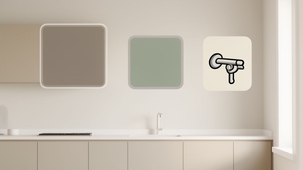
Get up close and personal with your countertops. What’s the main color, really? More importantly, what are the undertones? Look for the little specks and veins. Are they gray, beige, black, or even a hint of burgundy? Those secondary colors are your secret weapon—they offer a perfect, built-in palette to pull from for your cabinets.
Now, look down at your floors. Warm hardwood has its own personality. A deep walnut floor, for example, often begs for lighter cabinets to keep the room from feeling like a cave. On the flip side, light oak or maple floors can provide the perfect canvas for a dramatic, moody color like deep navy or forest green. This foundational step is especially critical in larger-scale projects like full condo remodeling services, where every single finish has to work together perfectly.
My Go-To Trick: Snap a good, clear photo of your countertop and floor in natural daylight. Upload it to a computer and use a free online color-picker tool to pull out the subtle undertones. You'll be amazed to discover faint blues, greens, or reds you never noticed, which can guide you to the perfect complementary cabinet color.
See How Lighting Changes Everything
Lighting is the final, and most deceptive, piece of the puzzle. A color never looks the same from one room to the next, and it's all because of light.
A kitchen drenched in warm, south-facing sun will make any color appear brighter and more yellow. That same color in a north-facing room, which gets cooler, indirect light, might suddenly look grayer or bluer.
And don't forget your artificial lights! The warm glow from your pendant lights versus the cool, crisp light from under-cabinet LEDs will completely change how your cabinet color looks after the sun goes down. What you love at 10 AM might look totally different at 7 PM.
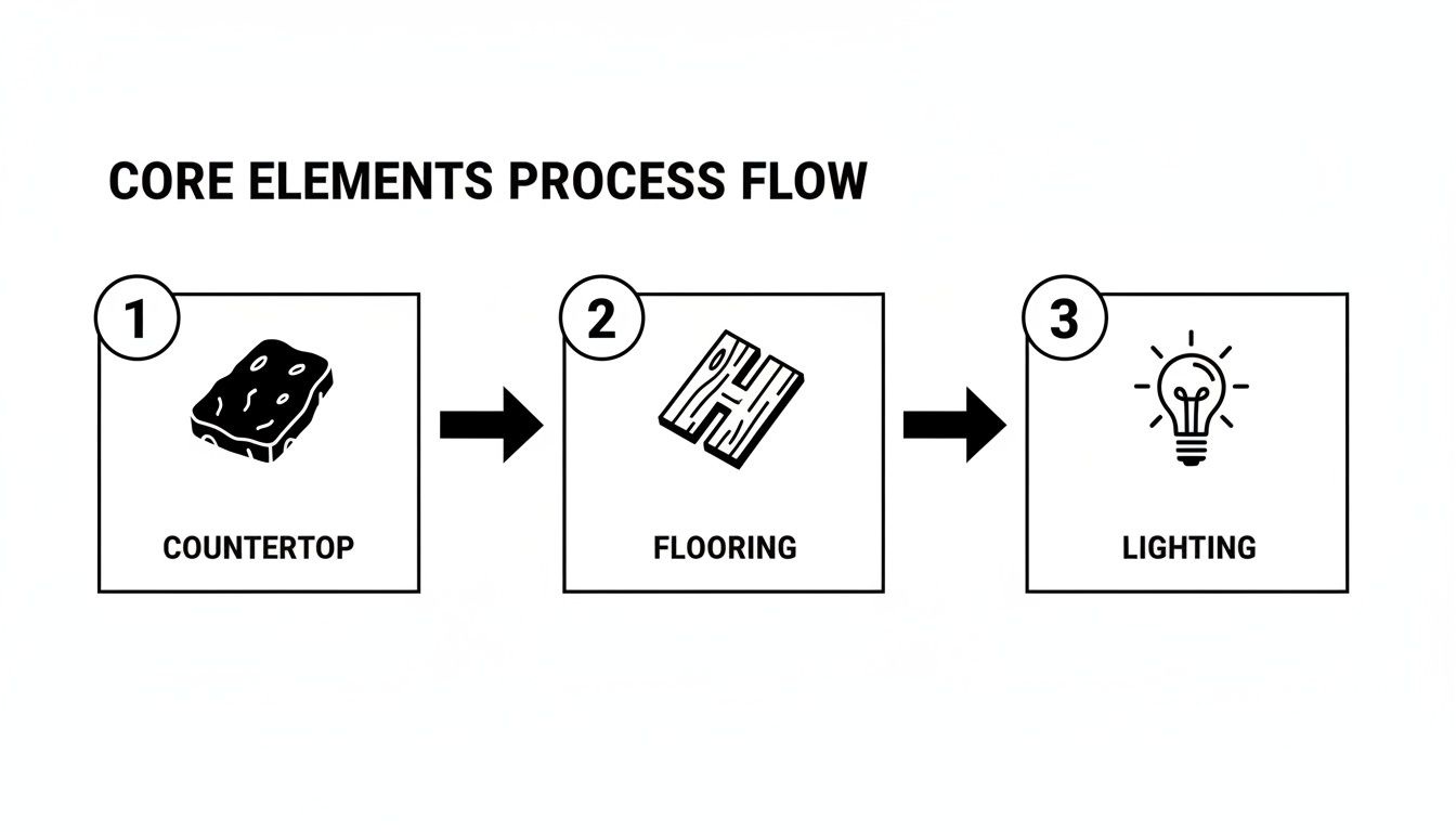
This process—countertops, then flooring, then lighting—creates a solid framework. By letting these core elements guide you, you’re setting yourself up for a choice that feels cohesive and intentional.
Of course, the best way to see how different colors will actually look with your specific lighting is to visualize it. This is where a good design tool comes in handy. Our room planner app lets you upload a photo of your kitchen and test-drive different cabinet colors in your real space, so you can see the effect of your lighting firsthand.
Find a Color Palette That Matches Your Style
Now that you’ve taken stock of your kitchen’s fixed elements, it’s time for the really fun part: weaving your personal style into a color scheme that works. Your cabinet color is probably the single biggest decision you'll make to define the room's entire personality. This isn't just about grabbing a color swatch you like; it’s about choosing a hue that tells a story and sets the mood you want to live in every day.
What kind of feeling are you going for? If you love the cozy, lived-in vibe of a modern farmhouse, you'll likely gravitate toward warm, creamy whites, soft beiges, or maybe a muted sage green. On the other hand, if a sleek, contemporary kitchen is more your speed, you might explore dramatic charcoals, deep navy blues, or even a single bold, saturated color to make a real statement.
Figuring out your go-to style is the best way to cut through the noise and narrow down thousands of options to just a handful. If you need some inspiration, browsing different interior design styles is a great way to see what really clicks with you.
Create Balance with the 60-30-10 Rule
Feeling overwhelmed? There's a classic interior design trick for that. The 60-30-10 rule is a simple but incredibly effective guideline for distributing color in a way that feels balanced and intentional. It keeps any one element from taking over.
Here’s the breakdown:
60% is your main color. In a kitchen, this is almost always your cabinet color. It's the dominant shade that sets the overall tone.
30% is your secondary color. This color plays a supporting role and is usually found on the walls, a large rug, or maybe the backsplash.
10% is your accent color. These are the fun pops of personality! Think cabinet hardware, light fixtures, bar stools, or small decor. This is your chance to get bold with metallics or a vibrant hue.
Let’s say you pick a soft gray for your cabinets (60%). You could pair that with a clean, crisp white for your walls and backsplash (30%), then bring in matte black hardware and a matching faucet for your accents (10%). See? This simple framework makes your kitchen look cohesive and professionally pulled together.
Pro Tip: Don't let trends bully you. It’s great to get inspired by what's popular, but your kitchen should feel like you. Pick a main color you truly love, and remember that you can always swap out the 10% accent pieces later as your tastes—and the trends—change.
Coordinate with Your Flooring
Your cabinets might be the star of the show, but their relationship with the floor is a critical one. Together, these two surfaces cover the most real estate in your kitchen, so making sure they work together is key to a harmonious look. For a deeper dive, check out this comprehensive guide to hardwood floor refinishing colors to see how different tones can impact a room.
Think about the contrast. Dark wood floors, for example, can make a space feel grounded but also a bit smaller. Pairing them with lighter cabinets is a classic move that opens everything up and creates a beautiful, balanced contrast.
Conversely, light-colored floors give you more freedom to play. You can go with darker or more colorful cabinets without worrying about the room feeling too heavy or closed-in. It’s this interplay between the floor and your cabinets that really pulls the whole design together.
4. Nail the Undertones and Finishes for a Pro Look
Have you ever picked a paint color that looked perfect on the chip, only to find it looks completely… off on your walls? The culprit is almost always the undertone. These are the subtle colors hiding beneath the main hue, and they can make or break a cohesive kitchen design.
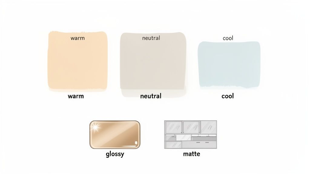
Understanding these subtle hues is one of the most important things you'll learn when figuring out how to choose kitchen cabinet colors. A seemingly simple gray might have cool blue or purple undertones, while another could lean warm with hints of green or yellow. If your granite countertop has beautiful warm, golden-brown veining, pairing it with a blue-gray cabinet will create a subtle clash that just feels wrong.
A Quick Undertone Test: Place your paint chip next to a pure white piece of paper. The stark contrast makes it much easier to see the underlying warm (yellow, red) or cool (blue, green) tones.
Matching undertones between your cabinets and fixed elements like countertops and backsplashes is non-negotiable for a professional look. A warm, creamy white cabinet will beautifully complement a beige-toned countertop, whereas a stark, cool white would look jarring against it. Harmony is found in these hidden details.
Finding the Right Cabinet Finish
Once you've sorted out the undertones, your next big decision is the finish—or sheen. This choice impacts not just the look but also the durability and maintenance of your cabinets, which are some of the hardest-working surfaces in your home.
The finish you select can completely change how a color looks and feels in the room. A high-gloss finish reflects a ton of light, making the color appear brighter and more intense. On the flip side, a matte finish absorbs light, giving that same color a softer, more muted, and sophisticated vibe.
Let's break down the most common options:
Matte Finish: Gives you a modern, velvety look with zero shine. It’s fantastic at hiding minor surface imperfections but can be tougher to clean, making it a better choice for kitchens that see less daily wear and tear.
Satin/Eggshell Finish: This is the most popular choice for a reason. It has a soft, low-key luster and hits that sweet spot between durability and cleanability without being overly shiny. It’s a reliable workhorse for just about any family kitchen.
Semi-Gloss/High-Gloss Finish: These finishes are incredibly durable and easy to wipe down, standing up to splatters and spills with ease. The high reflectivity can make a bold statement and brighten a dark space, but be warned: it will also highlight every single fingerprint and imperfection on the surface.
Ultimately, choosing a finish is a trade-off between looks and practicality. A busy kitchen with young kids will probably benefit from the resilience of a satin finish. But if you're aiming for a high-end, contemporary feel, you might be drawn to a luxurious matte look. Your final decision should balance how you want your kitchen to look with how you actually live in it.
See Your New Kitchen Before You Commit
Let’s be honest, picking a new kitchen cabinet color from a tiny two-inch swatch is a huge gamble. What looks like a soft, welcoming greige under the perfect lighting of a paint store can easily turn into a drab, muddy brown in your own kitchen. This is where we stop guessing and start seeing.
Modern visualization tools completely change the game. Instead of just crossing your fingers and hoping for the best, you can see your vision come to life with stunning accuracy before a single can of paint is opened. This isn't just about dodging a color mistake; it's about giving you the confidence to make a bolder, more informed choice you'll love for years.
Bring Your Vision to Life Digitally
Imagine testing dozens of paint shades from brands like Sherwin-Williams or Benjamin Moore in a matter of minutes. AI-powered design apps let you upload a photo of your kitchen and digitally "paint" your cabinets with any color you can think of.
This process gives you an immediate, realistic preview of how a specific shade will interact with your countertops, backsplash, and flooring. You can see precisely how that deep navy blue looks against your quartz or how a soft sage green pairs with your warm oak floors—all within the unique lighting of your own space. Get a feel for the process with our detailed guide on how to visualize your kitchen cabinet colors with AI.
Expert Tip: Digital mockups are your secret weapon against color regret. They close the gap between imagination and reality, ensuring the color you choose is one you’ll love every day, not just in the store.
This approach is especially helpful for navigating trends. For instance, warm neutrals are a massive favorite for kitchen cabinets, with a staggering 96% of designers naming them the top choice in a National Kitchen & Bath Association survey. With a tool like Decor8 AI, you can test these popular colors by selecting creamy whites or versatile greiges and getting instant renders with accurate lighting and shadows.
Visualizing first is smart money. Industry data shows that 42% of remodels go over budget, often due to fixing choices like a paint color that just didn't work out. Seeing it first helps you get it right the first time.
Cabinet Color Testing Methods Comparison
Before committing to a final color, it's crucial to test your top contenders. The right testing method can mean the difference between satisfaction and regret. Here’s a quick comparison of the traditional approach versus modern digital tools.
Method | Accuracy | Cost | Time Investment | Key Benefit |
|---|---|---|---|---|
Paint Swatches | Low | Low | Moderate | Tangible feel of the paint color |
Sample Pots | High | Moderate | High | Best real-world test for a single color |
Peel-and-Stick | Moderate | Moderate | Low | Easy to move around and test in different light |
AI Mockups | High | Low | Very Low | Instantly visualize dozens of colors in context |
While nothing beats a physical sample for the final decision, AI visualization is the clear winner for narrowing down your options. It saves you time, money, and the hassle of buying multiple sample pots for colors that were never going to work in the first place.
How to Create an Effective Mockup
Getting a useful digital preview is quick and painless. Here’s how to get a crystal-clear picture of your future kitchen:
Snap a Good Photo: Stand back and take a clear, well-lit picture of your kitchen during the day. Make sure it captures your cabinets, countertops, backsplash, and flooring for the most accurate result.
Upload and Select: Pop the photo into the app and use the selection tool to highlight just the cabinets. This tells the AI exactly what to "paint."
Play with Colors: Now for the fun part! Start applying different shades. Try colors from the built-in palettes or type in a specific paint code if you have one you're curious about. Don't be shy—try something bold! It costs nothing to explore.
Save and Compare: Save your favorite mockups and look at them side-by-side. This is the best way to notice the subtle differences and decide which color truly pulls the whole room together.
Test Colors the Right Way for Flawless Results
Digital mockups are brilliant for getting you 90% of the way there, but the last 10% is non-negotiable: you have to see how a color actually behaves in your kitchen. This is where the screen gets put away and reality takes over. Frankly, it's the most critical part of choosing cabinet colors with zero regrets.
The single biggest mistake I see homeowners make is painting a tiny test swatch directly onto their old cabinets. Think about it: if you slap a light gray sample over dark cherry wood, that deep red base is going to completely throw off the new color. It will look muddy, dark, and nothing like what you expected. You'll never get a true read that way.
Use Large, Movable Sample Boards
The professional method is incredibly simple but so much more effective. Grab a few large poster boards or even small pieces of drywall and paint your top two or three color contenders on them. Don't be shy with the paint—give them at least two full coats to see the true, rich color.
Once they're dry, these boards become your most powerful decision-making tool. You can move them all around the room to see how the color really interacts with the light and your existing finishes.
This approach lets you:
Check the color right against your countertop. Just prop the board up and see how they play together.
See how it looks next to your flooring and backsplash from every angle, not just one fixed spot.
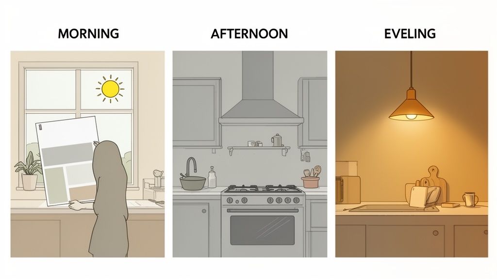
Observe the color as the light changes. Place it by the window in the bright morning sun, then move it to a shadowy corner, and finally see it under your artificial lights at night.
A color can shift dramatically throughout the day. That lovely warm greige that looked perfect at 10 a.m. might turn strangely pink under your LED pendants at night. This process reveals those pesky shifts before you've committed to gallons of paint and a weekend of work. While a free AI interior design tool to visualize wall paint colors gives you a fantastic head start, physical samples are what seal the deal.
Pro Tip: When you think you've found "the one," leave the sample board propped up in a prominent spot for a few days. Live with it. Glance at it while you make coffee, cook dinner, and unload the dishwasher. Your gut reaction after seeing it over and over is usually the right one.
Your Final Pre-Purchase Checklist
Before you head to the paint store, run through this final mental checklist with your chosen sample board in hand. This is your last chance to make sure you've covered all your bases and can feel completely confident in your decision.
Morning Light: Does the color feel fresh and true when the sun is bright?
Afternoon Light: How does it hold up in the softer, warmer light of the afternoon?
Artificial Light: Do you still love it at night, under your kitchen’s actual light fixtures?
Countertop Harmony: Does it truly complement the undertones in your counters, or is something clashing?
Floor & Backsplash Coordination: Does it pull everything together for a cohesive look?
The Vibe Check: Does this color actually create the mood you were hoping for?
If you can answer "yes" to all of these, you’ve done your homework. You’ve successfully navigated the tricky parts of the process and are ready to create a kitchen you’ll absolutely love for years to come.
Watch Out for These Common Cabinet Color Blunders
Choosing the right kitchen cabinet color is as much about dodging common mistakes as it is about finding that perfect shade. A little foresight can save you from the expensive headache of color regret, so let's walk through the traps I see homeowners fall into time and again.
The biggest mistake? Easily #1 is ignoring the light in your own home. That dreamy, soft gray you fell in love with at the showroom can turn into a cold, gloomy purple under the cool, north-facing light of your kitchen. On the flip side, a warm, creamy beige that looked perfect on a paint chip might suddenly feel sickly yellow once your evening light fixtures are on.
Another classic error is picking a color in a total vacuum. Your cabinets have to live with everything else in the room—and even the rooms next to it. A bold, of-the-moment color might look stunning in a magazine, but if it clashes horribly with the warm hardwood floors in your dining room, it creates a jarring, disjointed feeling that throws off the flow of your whole home.
Don't Sweat the Big Stuff, Then Forget the Small Stuff
It’s easy to get so fixated on the main color that you completely overlook how the finish changes everything. A high-gloss finish, for instance, will reflect more light and make any color feel more vibrant and intense. A matte finish, however, will absorb light, giving that same color a much softer, more muted character.
This isn't just about looks, either. A matte finish might feel incredibly chic and modern, but it's notoriously harder to wipe down than a satin or semi-gloss—a critical detail if you have kids or a high-traffic kitchen.
Here's a piece of advice I always give: don't let a fleeting trend bully you into a decision. It's fine to get inspired by what's popular, but choosing an ultra-trendy color can make your kitchen feel dated in just a few short years. Go for a color that truly reflects your personal style, not just what's hot right now. You'll love it for much longer.
Most of these mistakes happen when you rush the process. Slow down, test your samples the right way, and think through every element. For more design strategies and ideas, you can always explore our Decor8 AI blog for fresh inspiration.
To make it even easier, here's a quick rundown of what not to do:
Clashing Undertones: Pairing a cabinet color with cool, blue undertones against a countertop with warm, yellow undertones is a recipe for a room that just feels "off."
Forgetting Your Hardware: If you're keeping your existing pulls and knobs, make sure your new cabinet color complements their finish, whether it's brass, chrome, or black.
Ignoring Appliances: That big stainless steel fridge has a distinct cool, metallic look. Your cabinet color needs to play nicely with it.
Sticking to "Small Kitchen" Rules: Don't automatically rule out dark colors in a small space! While light colors can feel airy, a rich, dark hue can add incredible depth and sophistication without making the room feel smaller.
By keeping these common missteps in mind, you're not just picking a color—you're making a smart, holistic design choice that will lead to a kitchen you love for years to come.
Comments