Top 10 Best Paint Colors for Office Productivity in 2025
- oliverjames0609
- 12 minutes ago
- 19 min read
The right paint color can transform an office from a place of work into a hub of productivity, creativity, and focus. But with thousands of shades to choose from, finding the perfect one often feels overwhelming. Color psychology is more than just theory; it directly impacts mood, energy levels, and even cognitive performance. A sterile, uninspired space can lead to fatigue, while a thoughtfully chosen palette can reduce stress, enhance collaboration, and signal professionalism to clients. This guide cuts through the noise, presenting a curated list of the 10 best paint colors for office environments, complete with specific brand names and hex codes.
We'll explore why each color works, where to use it for maximum impact, and how to pair it for a cohesive, professional look. To broaden your perspective on creating an inspiring and productive environment, check out other expert recommendations for the 8 best paint colors for offices to see how regional trends and lighting can influence choices.
Whether you're designing a corporate headquarters, a collaborative startup space, or a focused home office, these expert-backed selections provide the foundation for a more productive and inspiring workday. We will provide actionable advice for different office types, lighting conditions, and aesthetic goals. This list is designed to eliminate the guesswork and help you make a confident choice before picking up a brush, ensuring the final result is a space that works as hard as you do.
1. Sherwin-Williams Alabaster (SW 7008) - Timeless Neutral Base
Sherwin-Williams Alabaster is a soft, warm off-white that serves as the quintessential foundation for any professional office environment. Far from being a stark, clinical white, Alabaster (HEX: #EDEAE0) has subtle creamy undertones that create a clean, sophisticated, and inviting atmosphere. It’s a color that promotes focus by minimizing visual distractions, making it one of the best paint colors for office spaces designed for deep work and clarity.

This color's popularity in real estate staging and high-end commercial design, like the minimalist offices seen at Apple, is no accident. Alabaster reflects natural and artificial light beautifully, making spaces feel larger, brighter, and more welcoming. This quality also ensures it photographs exceptionally well, a key benefit for creating photorealistic renderings or marketing materials.
Why It Works for an Office
Alabaster is a versatile chameleon. Its warmth prevents it from feeling sterile, while its neutrality allows it to support any design style, from modern minimalist to traditional. This makes it an ideal canvas that can easily be adapted as your business or personal style evolves. It provides a sense of calm and order without feeling cold or impersonal.
For those planning a complete workspace overhaul, this color serves as an excellent starting point. If you're looking for more ideas on building a productive workspace from the ground up, explore our guide on designing a home office that inspires creativity.
Actionable Tips for Implementation
Lighting is Key: Pair Alabaster with warm-toned lighting (bulbs in the 2700K-3000K range) to enhance its creamy undertones and create a cozy, inviting glow. Cool lighting can make it appear slightly gray.
Create Depth with an Accent: Use Alabaster on three walls and paint a fourth accent wall in a deeper, complementary color like a charcoal gray or navy blue to add visual interest without overwhelming the space.
Perfect for Virtual Staging: Its neutral base makes it a fantastic "before" color in Decor8 AI renderings. The contrast when applying new colors or furniture shows the maximum transformation potential to clients.
Trim and Ceiling Pairing: For a seamless, modern look, paint the trim and ceiling in the same Alabaster finish. For a more traditional feel, use a crisp, pure white like Sherwin-Williams Extra White (SW 7006) on the trim to create a subtle contrast.
2. Benjamin Moore HC-172 Healing Aloe - Calming Green Accent
Benjamin Moore's Healing Aloe is a soft, muted sage-green that introduces a sense of tranquility and focus into a workspace. This sophisticated hue (HEX: #CAD3C5) leans into the principles of biophilic design, which connects our innate need to affiliate with nature to our modern built environments. As one of the best paint colors for office settings, it is scientifically linked to reduced stress and enhanced creativity, making it a perfect choice for spaces designed for wellness and concentration.

The rise of corporate wellness initiatives and the focus on mental clarity has propelled Healing Aloe into the spotlight. It's a color seen in the wellness-focused break rooms of tech giants like Google and in modern healthcare facilities to promote a calming atmosphere. Its gentle, restorative quality makes it ideal for executive suites, creative agency brainstorm rooms, or any area where quiet contemplation is key.
Why It Works for an Office
Healing Aloe works by subtly mimicking the restorative colors found in nature. This connection helps to lower heart rates and reduce mental fatigue, which in turn boosts productivity and cognitive function. It is a sophisticated, grown-up green that feels professional and serene, avoiding the overly bright or distracting tones of more saturated greens. It provides a refreshing yet understated backdrop that supports both individual focus and collaborative calm.
This color is especially effective for creating a specific mood. You can easily see how different wall colors can completely transform a room by using a free AI interior design tool to visualize wall paint colors and find the perfect shade for your goals.
Actionable Tips for Implementation
Create a Focal Point: Use Healing Aloe on a single accent wall, perhaps behind a desk or in a reading nook, to create a calming focal point without overwhelming the entire room.
Embrace Natural Pairings: Enhance its biophilic benefits by pairing it with natural wood tones, live plants, and textiles like linen or wool. It also pairs beautifully with soft whites like BM Chantilly Lace for trim.
Test Lighting Scenarios: This color can shift from a soft green to a subtle gray-green depending on the light. Test a sample in your space and observe it in natural daylight, warm artificial light, and cool artificial light before committing.
Showcase a Wellness Transformation: In Decor8 AI, Healing Aloe is perfect for "before and after" renderings. Use it to show clients how a standard office can be transformed into a modern, wellness-focused environment.
3. Behr Intellectual (N510-1) - Deep Navy Professional Authority
Behr Intellectual is a sophisticated, deep navy blue that embodies professional authority and stability. This commanding shade (HEX: #565D67) is a favorite in corporate design for its ability to convey trust, intelligence, and confidence. Unlike black, which can feel harsh, this rich navy creates a sense of depth and seriousness without closing off a space, making it one of the best paint colors for office environments that need to project a strong, credible image.
This color is frequently seen in high-stakes environments like the executive offices at Goldman Sachs or the boardrooms of prestigious law firms. Its power lies in its psychological impact. The deep blue tone is grounding and promotes focused thought, ideal for spaces dedicated to critical decision-making. In virtual renderings, its dramatic nature creates a powerful "before and after" effect, showcasing a stunning transformation from a plain room to a high-end professional suite.
Why It Works for an Office
Intellectual commands respect. Its deep, saturated tone adds a layer of luxury and gravitas to any room, making it perfect for an executive office, a formal meeting room, or a client-facing reception area. It establishes a mood of focus and dependability, helping to build client confidence and reinforce a company's established presence. It pairs exceptionally well with rich wood tones, leather, and metallic accents.
Actionable Tips for Implementation
Strategic Accent Wall: Use Intellectual on a single accent wall, typically the one behind a primary desk or a conference room monitor, to create a strong focal point without overwhelming the room. Pair it with a crisp off-white or light gray on the other walls.
Embrace Warm Metallics: Combine this deep navy with brass or brushed gold fixtures, hardware, and lighting. The warmth of the metal creates a striking, luxurious contrast against the cool blue backdrop.
Lighting for Depth: Illuminate the space with warm-toned lighting (around 2700K) to bring out the navy's richness and prevent it from appearing too dark or flat. This is crucial for creating an executive ambiance.
Virtual Staging Impact: When using Decor8 AI, test this color with professional lighting presets to demonstrate its true depth and luxurious potential to clients. It’s excellent for visualizing luxury office transformations.
4. Sherwin-Williams Sea Salt (SW 6204) - Soft Coastal Professional
Sherwin-Williams Sea Salt is a chameleon-like color that masterfully blends soft blue, green, and gray to create a serene yet professional atmosphere. Unlike more saturated colors, Sea Salt (HEX: #D5DAD5) offers a subtle hint of personality that promotes calm and reduces stress without sacrificing sophistication. It’s one of the best paint colors for office environments that aim to feel modern, airy, and connected to nature.
This color has gained significant traction in contemporary corporate design, particularly within tech companies and creative agencies seeking to foster a calm, focused, and welcoming culture. Sea Salt bridges the gap between warm and cool tones, allowing it to adapt beautifully to different lighting conditions and complement a wide range of materials, from natural wood to sleek metallics. Its calming presence is ideal for high-pressure work environments.
Why It Works for an Office
Sea Salt is exceptionally versatile because its appearance shifts with the light. In bright, natural light, its green and blue undertones come forward, creating a fresh, coastal feel. In lower or artificial light, its subtle gray tones dominate, providing a more grounded and professional look. This adaptability makes it a perfect backdrop for both collaborative and individual workspaces, offering a touch of color that is calming rather than distracting.
Actionable Tips for Implementation
Test in Different Lights: Due to its complex undertones, test Sea Salt on different walls and observe it throughout the day. Its color can shift dramatically, so ensure you love how it looks in your specific lighting conditions before committing.
Pair with Natural Textures: Enhance its organic feel by pairing it with warm woods, woven textiles, and live plants. This combination creates a balanced, biophilic design that can boost well-being and productivity.
Crisp White Trim: Use a clean, crisp white like Sherwin-Williams Extra White (SW 7006) for trim and ceilings. This creates a sharp contrast that makes the subtle tones of Sea Salt pop, defining the space beautifully.
Ideal for Renderings: Sea Salt is an excellent choice for showing modern office renovations in before-and-after renderings. It provides enough color to demonstrate a significant change from a basic neutral without overwhelming the design.
5. Benjamin Moore HC-80 Chelsea Gray - Sophisticated Neutral Bridge
Benjamin Moore's Chelsea Gray is a rich, warm gray that acts as a sophisticated bridge between light neutrals and deep, dramatic colors. Unlike cooler grays that can feel industrial or somber, Chelsea Gray (HEX: #858378) has subtle brown undertones that give it depth and a welcoming, earthy quality. This makes it one of the best paint colors for an office that aims to be professional, grounded, and modern without feeling stark.
This color is a favorite among professional designers and real estate stagers for its ability to create a layered, high-end look. It works beautifully in contemporary startup offices, modern architectural firms, and boutique consulting headquarters where a sense of established credibility is key. Its chameleon-like nature allows it to adapt to different lighting conditions, appearing more gray in cool light and warmer, almost taupe, in direct sunlight.
Why It Works for an Office
Chelsea Gray provides a sense of stability and focus. Its medium depth is perfect for reducing glare on screens without making the room feel dark or enclosed. It creates a distinguished backdrop that allows furniture, artwork, and branding elements to stand out with clarity. This makes it an ideal choice for client-facing spaces like reception areas, conference rooms, or executive offices where making a strong first impression matters.
The color's versatility also means it can support a wide range of design aesthetics, from minimalist to rustic industrial. Because it’s a neutral with character, it won’t feel dated quickly. If you are working with a more compact space, you can explore our guide on the best paint colors for small rooms for more ideas on using mid-tone colors effectively.
Actionable Tips for Implementation
Layer with Textures: To prevent this mid-tone gray from feeling flat, introduce a variety of textures. Pair it with warm woods, polished metals, plush fabrics, and leather to create a rich, tactile environment.
Balance with Light Trim: Use a crisp, clean white like Benjamin Moore Chantilly Lace (OC-65) on trim and ceilings. This contrast will make the Chelsea Gray appear more intentional and sophisticated while keeping the space feeling bright.
Test in Your Lighting: Chelsea Gray's undertones are highly sensitive to light. Test a swatch on multiple walls and observe it throughout the day to ensure it aligns with your vision. It is also an ideal color to test in Decor8 AI to see how different virtual lighting scenarios affect its perception.
Create a Focal Point: Use it as an accent wall behind a reception desk or on the primary wall of a conference room to add gravitas and draw attention to the most important area of the space.
6. Sherwin-Williams Urbane Bronze (SW 7048) - Modern Executive Depth
Sherwin-Williams Urbane Bronze is a deep, sophisticated brown-gray hybrid that brings an air of modern authority to any workspace. This rich, grounding color (HEX: #54504A) masterfully combines the natural warmth of brown with the sleek, contemporary edge of gray. Named the 2021 Sherwin-Williams Color of the Year, it has become a go-to choice for creating an environment that feels both luxurious and approachable, making it one of the best paint colors for office settings aiming for executive polish.
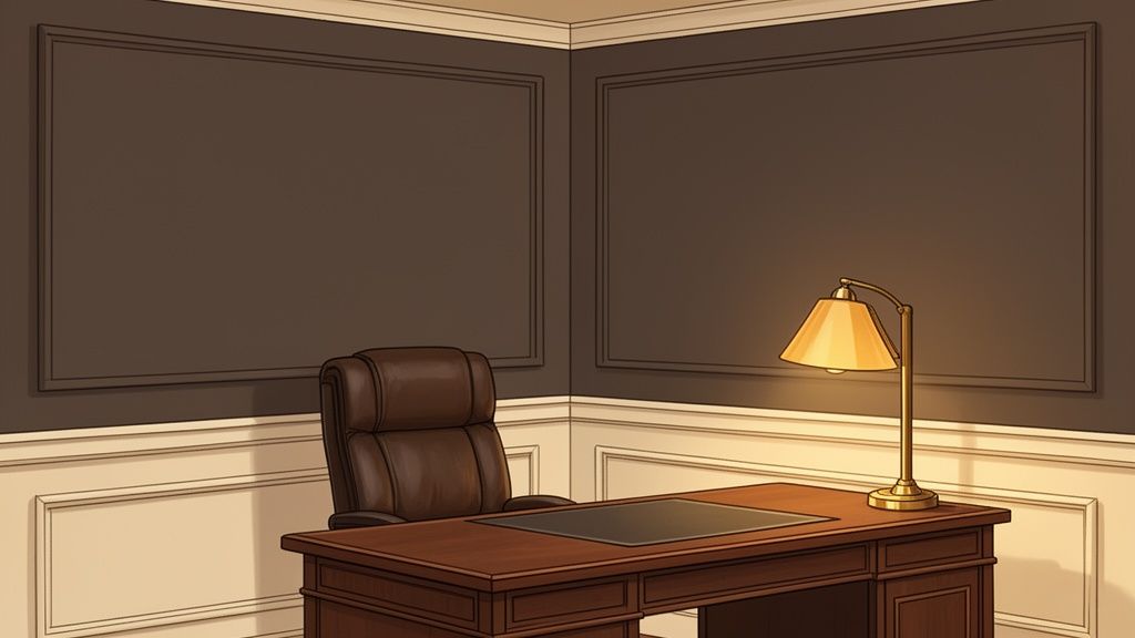
Its popularity in high-end design, such as premium law firms and luxury real estate offices, is well-deserved. Urbane Bronze establishes a sense of stability and confidence, enveloping the room in a cozy yet powerful embrace. This color creates a stunning backdrop that makes wood tones, metallic accents, and leather furniture stand out, ideal for crafting photorealistic renderings that convey prestige and quality.
Why It Works for an Office
Urbane Bronze conveys seriousness and sophistication without feeling cold or intimidating. Its warm undertones foster a sense of comfort and security, which can help in high-stakes environments. This color is perfect for an accent wall behind a desk or for an entire room in a larger executive suite, creating a focused, distraction-free zone that commands respect. It’s a bold choice that signals confidence and modern leadership.
Actionable Tips for Implementation
Balance with Light: Urbane Bronze is a dark color, so it works best in offices with ample natural or artificial light. Pair it with lighter flooring, furniture, and off-white or beige trim to prevent the space from feeling too heavy.
Create a Moody Accent: Use it on a single accent wall, built-in shelving, or cabinetry to add depth and drama. This is especially effective in smaller home offices where painting all four walls might feel overwhelming.
Embrace Rich Textures: This color pairs beautifully with natural materials. Combine it with walnut or oak wood, leather chairs, brass or matte black fixtures, and woven textiles to create a layered, high-end look.
Visualize in Virtual Staging: Given its bold nature, Urbane Bronze is a fantastic color to test in Decor8 AI. Use it to showcase a luxury office transformation, demonstrating how a powerful color can redefine a space for high-end clients.
7. Behr Dynasty (N400-1) - Professional White-Gray Minimalist
Behr Dynasty is a crisp, light gray that masterfully bridges the gap between stark, clinical whites and warmer off-white tones. As an almost-white shade, Dynasty (HEX: #E9EAE5) offers a clean, contemporary backdrop that is perfectly suited for a minimalist office design without any of the harshness. It creates a modern, sophisticated atmosphere that promotes clarity, making it one of the best paint colors for office environments focused on precision and undistracted work.
This color is a favorite in environments where the architecture and furnishings are meant to stand out, such as in minimalist tech startups, modern architecture firms, and contemporary art studios. Dynasty serves as a subtle, elegant canvas that enhances the objects within the space rather than competing with them. It reflects light efficiently, making spaces feel open, airy, and impeccably clean.
Why It Works for an Office
Dynasty provides a sense of calm and order that is essential for deep focus. Its cool neutrality is inherently professional and forward-thinking, aligning perfectly with modern corporate aesthetics. Unlike pure white, its subtle gray undertone adds a layer of visual sophistication and depth, preventing the space from feeling flat or sterile. It's a color that signifies precision, efficiency, and modernism.
This shade is a cornerstone of clean, uncluttered design. For those looking to create a workspace that embodies this philosophy, understanding the core principles is key. You can explore these concepts further in our guide to mastering the minimalist design style.
Actionable Tips for Implementation
Balance with Texture: To prevent a minimalist space from feeling cold, pair Dynasty's cool tone with warm, natural textures like light wood (oak, maple), leather, wool, or live plants. This creates a balanced and inviting environment.
Use High-Contrast Accents: Make a bold statement by using black or dark charcoal for window frames, furniture, or light fixtures. The sharp contrast with Dynasty walls creates a striking, high-impact look.
Showcase with Renderings: In Decor8 AI, use Dynasty to demonstrate how a minimalist backdrop can make high-end furniture and art collections pop. It’s perfect for showing clients the power of a "less is more" approach in office design.
Lighting Considerations: Dynasty adapts beautifully to different lighting. In natural light, it appears as a soft, bright off-white. Under cool-toned LED lighting (4000K-5000K), its gray undertones become more pronounced for a distinctly modern, crisp feel.
8. Benjamin Moore HC-168 Hale Navy - Timeless Classic Authority
Benjamin Moore's Hale Navy is a deeply saturated, timeless navy that commands respect and conveys an air of professional authority. Unlike starker navies, Hale Navy (HEX: #4F585C) possesses a subtle gray undertone, which gives it a sophisticated, classic feel. It is one of the best paint colors for office spaces designed to project confidence and stability, making it a go-to for law firms, financial institutions, and executive suites.
This color's iconic status in professional interior design is well-earned. It creates a powerful backdrop that feels both grounded and luxurious, as seen in the offices of consulting firms like McKinsey & Company. Hale Navy provides a rich depth that makes wood tones, leather furniture, and metallic accents pop, creating a polished and curated look.
Why It Works for an Office
Hale Navy is the ultimate color for creating a focal point and establishing a serious, focused atmosphere. Its depth minimizes glare on screens and fosters concentration, yet its classic nature prevents it from feeling trendy or temporary. This color communicates tradition, trust, and expertise without saying a word, making it ideal for client-facing areas where first impressions are critical.
This authoritative shade pairs beautifully with lighter neutrals to maintain balance. If you need help finding the perfect complementary colors, you can find inspiration with a professional color scheme generator to build a cohesive and impactful palette.
Actionable Tips for Implementation
Create a Feature Wall: Use Hale Navy on a single accent wall, typically the one behind a primary desk or in a reception area, to add depth and make a strong statement without overwhelming the room.
Balance with Light: This is a dark color, so ensure the space has ample natural or layered artificial lighting to keep it from feeling too enclosed. Pair it with light-colored flooring and ceilings.
Lean into Luxury Materials: Hale Navy is the perfect partner for rich materials. Enhance its sophisticated feel with brass or gold fixtures, walnut or oak furniture, and leather seating.
Test for Professional Transformations: In Decor8 AI, use Hale Navy to demonstrate a dramatic office makeover. It provides a stunning contrast against a "before" of a neutral beige or white, showcasing a powerful shift to a more professional and established aesthetic.
9. Sherwin-Williams Accessible Beige (SW 7036) - Warm Professional Foundation
Sherwin-Williams Accessible Beige is a sophisticated neutral that masterfully blends the warmth of beige with the modern subtlety of gray. This creates a color that is professional yet deeply approachable. Far from a flat, traditional beige, Accessible Beige (HEX: #D1C7B8) has a complex, greige undertone that prevents it from looking dated, making it an excellent choice for offices that need to project both authority and warmth.
This color is particularly effective in client-facing environments like boutique law firms, real estate agencies, or consulting practices. It establishes a sense of stability and trust without feeling intimidating. Its ability to adapt to both natural and artificial light makes it a reliable backdrop that feels consistently welcoming throughout the day, which is why it’s one of the best paint colors for office settings prioritizing a human-centric design.
Why It Works for an Office
Accessible Beige provides a perfect middle ground. It's warmer and more inviting than a stark white or cool gray, but it retains a clean, professional feel that isn't distracting. This balance makes it ideal for spaces where important conversations and decisions happen. The color fosters a comfortable, grounded atmosphere that can help put clients and employees at ease. It serves as a solid foundation that supports a variety of decor styles, especially those incorporating natural wood tones and warm metals.
Actionable Tips for Implementation
Layer with Natural Textures: Pair Accessible Beige with dark wood furniture, leather accents, and brushed brass or bronze fixtures to create a rich, layered, and sophisticated look.
Balance with Crisp White: Use a clean, crisp white like Sherwin-Williams Pure White (SW 7005) for trim and ceilings. This contrast will make the Accessible Beige feel intentional and prevent the space from looking muddy.
Test Lighting Scenarios: This color's undertones can shift with lighting. Test it in your space and in a Decor8 AI rendering with warm lighting (2700K-3000K) to ensure it brings out the desired warmth and doesn't lean too gray.
Avoid Cool Tones: Steer clear of pairing it with cool blues or stark grays, which can clash with its warm undertones. Instead, lean into an earthy palette with deep greens, terracotta, or warm charcoals for accent colors.
10. Behr Slate (N350-4) - Contemporary Mid-Tone Sophistication
Behr Slate is a sophisticated mid-tone gray-blue that strikes a perfect balance between personality and professionalism. This contemporary color offers a compelling alternative to standard light neutrals or dramatic dark hues. Slate (HEX: #858E96) has a grounded, modern feel that adds visual interest and depth to a space while maintaining a credible, business-focused atmosphere.
Its rising popularity in modern corporate settings, particularly within creative agencies and progressive tech companies, speaks to its versatility. Slate creates an environment that feels both serious and innovative. The color is substantial enough to make a statement but muted enough to avoid being distracting, making it one of the best paint colors for office spaces that need to support both focused work and collaborative energy.
Why It Works for an Office
Behr Slate introduces a cool, calming presence that can help reduce stress while simultaneously fostering a sense of stability and authority. Its blue undertones are known to boost productivity, while the gray base keeps it from feeling overly vibrant or whimsical. This duality makes it an exceptional choice for companies looking to project a forward-thinking yet reliable brand image through their office design.
The color works well in both large open-plan offices and smaller private workspaces. It provides a rich backdrop that makes art, furniture, and branding elements pop, allowing a company's unique culture to shine through.
Actionable Tips for Implementation
Balance with Warmth: Since Slate is a cool-toned color, pair it with warm elements like wood furniture, leather accents, or brass and gold metal finishes. This creates a balanced, inviting, and dynamic contemporary aesthetic.
Test Lighting Conditions: Slate's appearance can shift significantly under different lighting. Use a tool like Decor8 AI to render the color under various lighting scenarios (daylight, warm artificial, cool artificial) to ensure it achieves the desired mood.
Ideal for Accent Walls: Use Slate on a primary accent wall, such as the one behind a reception desk or in a main conference room, to create a strong focal point. Pair it with a soft off-white on the remaining walls to keep the space feeling bright.
Showcase Transformation: This color is excellent for demonstrating a creative company culture transformation in design mockups. Applying Slate in a "before and after" rendering can powerfully illustrate a shift from a traditional workspace to a modern, innovative one.
Top 10 Office Paint Colors Comparison
Color (Brand & Name) | 🔄 Implementation complexity | ⚡ Resource requirements | 📊 Expected outcomes | 💡 Ideal use cases | ⭐ Key advantages |
|---|---|---|---|---|---|
Sherwin‑Williams Alabaster (SW 7008) | Low — straightforward prep & touch‑ups | Low — standard paint; warm lighting advisable | Bright, neutral backdrop; highly photogenic | Open‑plan offices, conference rooms, client spaces | ⭐ Universally flattering in photos; pairs with any accent |
Benjamin Moore HC‑172 Healing Aloe | Low–Moderate — sample for undertones | Moderate — lighting tests; plants/materials for biophilia | Calming, reduces visual fatigue; boosts focus | Accent walls, wellness rooms, creative nooks | ⭐ Promotes wellbeing; sophisticated green accent |
Behr Intellectual (N510‑1) | Moderate–High — multiple coats; careful detailing | High — premium paint; strong, controlled lighting | Authoritative, dramatic contrast; can cocoon space | Executive offices, boardrooms, client meeting rooms | ⭐ Conveys trust and professionalism; hides imperfections |
Sherwin‑Williams Sea Salt (SW 6204) | Moderate — test under varied lighting | Moderate — sample boards; layered materials | Serene, balanced; shifts subtly with light | Reception areas, collaborative spaces, creative teams | ⭐ Contemporary, versatile tone with photogenic depth |
Benjamin Moore HC‑80 Chelsea Gray | Moderate — sampling to confirm undertone | Moderate — quality paint; textured layering | Refined, nuanced depth; photographs well | Main office walls, transitional areas, staging | ⭐ Sophisticated neutral bridge; highly versatile |
Sherwin‑Williams Urbane Bronze (SW 7048) | High — skilled application to avoid flatness | High — top‑quality paint; warm professional lighting | Grounded, luxurious, dramatic visual impact | Executive suites, high‑end boardrooms, luxury staging | ⭐ Deep, timeless modernity; luxury finish |
Behr Dynasty (N400‑1) | Low–Moderate — subtle undertone control | Low — standard materials; texture/lighting layers | Clean, gallery‑like backdrop; highlights furnishings | Minimalist offices, galleries, tech spaces | ⭐ Crisp contemporary backdrop; elevates art and furniture |
Benjamin Moore HC‑168 Hale Navy | Moderate–High — lighting and accents critical | Moderate — quality paint; warm metallic accents | Authoritative yet welcoming; strong visual anchor | Client‑facing offices, receptions, boutique firms | ⭐ Classic, approachable navy; designer staple |
Sherwin‑Williams Accessible Beige (SW 7036) | Low–Moderate — select correct beige warmth | Low — standard paint; warm accents/textures | Warm, inviting, approachable professional tone | Reception areas, boutique/professional offices | ⭐ Warm foundation that complements many styles |
Behr Slate (N350‑4) | Moderate — undertone shifts require testing | Moderate — sample testing; balanced accents | Mid‑tone personality; balanced professionalism | Creative departments, modern HQs, accent walls | ⭐ Offers personality without overpowering; versatile |
Bringing Your Vision to Life: From Palette to Productivity
Choosing the right paint color for your office is far more than a simple decorative decision; it's a strategic move that directly influences the mood, energy, and productivity of a workspace. Throughout this guide, we've explored a curated selection of the best paint colors for office environments, each with a unique psychological impact and aesthetic appeal. From the warm, welcoming embrace of Sherwin-Williams Accessible Beige to the deep, authoritative confidence of Benjamin Moore Hale Navy, the power of color is undeniable.
You've seen how a soft green like Healing Aloe can introduce a sense of calm and focus, making it ideal for high-stress roles or creative thinking. We've contrasted that with the sophisticated, modern depth of Urbane Bronze, a color that commands respect in an executive suite or a high-end client-facing area. Each shade, whether it's the crisp minimalism of Behr Dynasty or the timeless neutrality of Alabaster, serves as a foundational element upon which a productive and inspiring office is built.
Key Takeaways: From Swatch to Strategy
Recapping the core principles, the most effective office color schemes are those chosen with intention. The goal is not just to find a color you like, but to select a palette that actively supports the work being done within the space.
Define Your Goal: The primary driver of your color choice should be function. Are you designing a space for intense, focused work? A calming hue like Sherwin-Williams Sea Salt might be perfect. Need to foster collaboration and energy? Consider warmer, more engaging tones.
Context is Everything: Remember that paint color does not exist in a vacuum. The deep, grounding effect of Behr Intellectual works best when balanced with ample natural light and lighter-toned furniture. A versatile neutral like Benjamin Moore Chelsea Gray excels because it adapts to various lighting conditions and pairs beautifully with bold accent pieces.
Test, Don't Guess: The single most critical step is to see the color in your actual environment. A paint chip held against a wall is a mere suggestion; how that color interacts with your specific overhead lighting, the sunlight from your windows, and the reflections from your flooring will dramatically alter its appearance.
Pro Tip: Before committing to a color, paint a large sample board (at least 2x2 feet) and move it around the room throughout the day. Observe how it looks in the bright morning sun, the softer afternoon light, and under your artificial lighting at night.
Your Actionable Next Steps
With this knowledge, you are now equipped to transform your office from a generic room into a purpose-built environment for success. The journey starts with a clear vision and ends with a confident decision.
Shortlist Your Favorites: Review the ten colors we've detailed. Based on your office's purpose (home office, corporate, creative studio) and its physical characteristics (size, lighting), select your top three contenders.
Analyze Your Space: Take stock of your existing elements. What color is your furniture? What undertones are in your flooring? Your chosen paint color should complement these components, not compete with them. For example, the warm greige of Accessible Beige is a fantastic choice for offices with warm wood tones.
Visualize and Validate: This is where modern technology becomes your most powerful tool. Instead of relying on imagination, use a virtual staging tool to see precisely how each of your shortlisted colors will look on your walls, with your furniture, in your lighting. This eliminates guesswork and prevents costly mistakes.
Choosing one of the best paint colors for office productivity is a powerful first step. However, a truly optimized work environment considers a holistic approach to employee well-being and performance. While thoughtful paint choices can significantly enhance focus and energy, explore further strategies to improve employee productivity to create a comprehensive system for success. By integrating intentional design with supportive workplace practices, you're not just decorating; you're engineering a better way to work. Your office walls are a blank canvas, waiting to become an active partner in your professional journey.
Ready to see these colors in your own office without lifting a paintbrush? Decor8 AI allows you to upload a photo of your space and instantly visualize any paint color on your walls. Stop guessing and start seeing what works—try Decor8 AI today to make your final decision with absolute confidence.
Comments